Introduction
The latest forecast discussions for Northern Alaska have included warnings that we are likely to experience an extended period of below normal temperatures starting at the end of this week, and yesterday’s Deep Cold blog post discusses the similarity of model forecast patterns to patterns seen in the 1989 and 1999 extreme cold events.
Our dogs spend most of their time in the house when we’re home, but if both of us are at work they’re outside in the dog yard. They have insulated dog houses, but when it’s colder than −15° F, we put them into a heated dog barn. That means one of us has to come home in the middle of the day to let them out to go to the bathroom.
Since we’re past the Winter Solstice, and day length is now increasing, I was curious to see if that has an effect on daily temperature, hopeful that the frequency of days when we need to put the dogs in the barn is decreasing.
Methods
We’ll use daily minimum and maximum temperature data from the Fairbanks International Airport station, keeping track of how many years the temperatures are below −15° F and dividing by the total to get a frequency. We live in a cold valley on Goldstream Creek, so our temperatures are typically several degrees colder than the Fairbanks Airport, and we often don’t warm up as much during the day as in other places, but minimum airport temperature is a reasonable proxy for the overall winter temperature at our house.
Results
The following plot shows the frequency of minimum (the top of each line) and maximum (the bottom) temperature colder than −15° F at the airport over the period of record, 1904−2016. The curved blue line represents a best fit line through the minimum temperature frequency, and the vertical blue line is drawn at the date when the frequency is the highest.

The maximum frequency is January 12th, so we have a few more days before the likelihood of needing to put the dogs in the barn starts to decline. The plot also shows that we could still reach that threshold all the way into April.
For fun, here’s the same plot using −40° as the threshold:

The date when the frequency starts to decline is shifted slightly to January 15th, and you can see the frequencies are lower. In mid-January, we can expect minimum temperature to be colder than −15° F more than half the time, but temperatures colder than −40° are just under 15%. There’s also an interesting anomaly in mid to late December where the frequency of very cold temperatures appears to drop.
Appendix: R code
library(tidyverse)
library(lubridate)
library(scales)

noaa <- src_postgres(host="localhost", dbname="noaa")

fairbanks <- tbl(noaa, build_sql("SELECT * FROM ghcnd_pivot
                                  WHERE station_name='FAIRBANKS INTL AP'")) %>%
    collect()

save(fairbanks, file="fairbanks_ghcnd.rdat")

for_plot <- fairbanks %>%
    mutate(doy=yday(dte),
           dte_str=format(dte, "%d %b"),
           min_below=ifelse(tmin_c < -26.11,1,0),
           max_below=ifelse(tmax_c < -26.11,1,0)) %>%
    filter(dte_str!="29 Feb") %>%
    mutate(doy=ifelse(leap_year(dte) & doy>60, doy-1, doy),
           doy=(doy+31+28+31+30)%%365) %>%
    group_by(doy, dte_str) %>%
    mutate(n_min=sum(ifelse(!is.na(min_below), 1, 0)),
           n_max=sum(ifelse(!is.na(max_below), 1, 0))) %>%
    summarize(min_freq=sum(min_below, na.rm=TRUE)/max(n_min, na.rm=TRUE),
              max_freq=sum(max_below, na.rm=TRUE)/max(n_max, na.rm=TRUE))

x_breaks <- for_plot %>%
    filter(doy %in% seq(49, 224, 7))

stats <- tibble(doy=seq(49, 224),
                pred=predict(loess(min_freq ~ doy,
                                   for_plot %>%
                                       filter(doy >= 49, doy <= 224))))

max_stats <- stats %>%
    arrange(desc(pred)) %>% head(n=1)

p <- ggplot(data=for_plot,
            aes(x=doy, ymin=min_freq, ymax=max_freq)) +
    geom_linerange() +
    geom_smooth(aes(y=min_freq), se=FALSE, size=0.5) +
    geom_segment(aes(x=max_stats$doy, xend=max_stats$doy,
                     y=-Inf, yend=max_stats$pred),
                 colour="blue", size=0.5) +
    scale_x_continuous(name=NULL,
                       limits=c(49, 224),
                       breaks=x_breaks$doy,
                       labels=x_breaks$dte_str) +
    scale_y_continuous(name="Frequency of days colder than −15° F",
                       breaks=pretty_breaks(n=10)) +
    theme_bw() +
    theme(axis.text.x=element_text(angle=30, hjust=1))

# Minus 40
for_plot <- fairbanks %>%
    mutate(doy=yday(dte),
           dte_str=format(dte, "%d %b"),
           min_below=ifelse(tmin_c < -40,1,0),
           max_below=ifelse(tmax_c < -40,1,0)) %>%
    filter(dte_str!="29 Feb") %>%
    mutate(doy=ifelse(leap_year(dte) & doy>60, doy-1, doy),
           doy=(doy+31+28+31+30)%%365) %>%
    group_by(doy, dte_str) %>%
    mutate(n_min=sum(ifelse(!is.na(min_below), 1, 0)),
           n_max=sum(ifelse(!is.na(max_below), 1, 0))) %>%
    summarize(min_freq=sum(min_below, na.rm=TRUE)/max(n_min, na.rm=TRUE),
              max_freq=sum(max_below, na.rm=TRUE)/max(n_max, na.rm=TRUE))

x_breaks <- for_plot %>%
    filter(doy %in% seq(63, 203, 7))

stats <- tibble(doy=seq(63, 203),
                pred=predict(loess(min_freq ~ doy,
                                   for_plot %>%
                                       filter(doy >= 63, doy <= 203))))

max_stats <- stats %>%
    arrange(desc(pred)) %>% head(n=1)

q <- ggplot(data=for_plot,
            aes(x=doy, ymin=min_freq, ymax=max_freq)) +
    geom_linerange() +
    geom_smooth(aes(y=min_freq), se=FALSE, size=0.5) +
    geom_segment(aes(x=max_stats$doy, xend=max_stats$doy,
                     y=-Inf, yend=max_stats$pred),
                 colour="blue", size=0.5) +
    scale_x_continuous(name=NULL,
                       limits=c(63, 203),
                       breaks=x_breaks$doy,
                       labels=x_breaks$dte_str) +
    scale_y_continuous(name="Frequency of days colder than −40°",
                       breaks=pretty_breaks(n=10)) +
    theme_bw() +
    theme(axis.text.x=element_text(angle=30, hjust=1))
Introduction
So far this winter we’ve gotten only 4.1 inches of snow, well below the normal 19.7 inches, and there is only 2 inches of snow on the ground. At this point last year we had 8 inches and I’d been biking and skiing on the trail to work for two weeks. In his North Pacific Temperature Update blog post, Richard James mentions that winters like this one, with a combined strongly positive Pacific Decadal Oscillation phase and strongly negative North Pacific Mode phase tend to be a “distinctly dry” pattern for interior Alaska. I don’t pretend to understand these large scale climate patterns, but I thought it would be interesting to look at snowfall and snow depth in years with very little mid-November snow. In other years like this one do we eventually get enough snow that the trails fill in and we can fully participate in winter sports like skiing, dog mushing, and fat biking?
Data
We will use daily data from the Global Historical Climate Data set for the Fairbanks International Airport station. Data prior to 1950 is excluded because of poor quality snowfall and snow depth data and because there’s a good chance that our climate has changed since then and patterns from that era aren’t a good model for the current climate in Alaska.
We will look at both snow depth and the cumulative winter snowfall.
Results
The following tables show the ten years with the lowest cumulative snowfall and snow depth values from 1950 to the present on November 18th.
| Year | Cumulative Snowfall (inches) |
|---|---|
| 1953 | 1.5 |
| 2016 | 4.1 |
| 1954 | 4.3 |
| 2014 | 6.0 |
| 2006 | 6.4 |
| 1962 | 7.5 |
| 1998 | 7.8 |
| 1960 | 8.5 |
| 1995 | 8.8 |
| 1979 | 10.2 |
| Year | Snow depth (inches) |
|---|---|
| 1953 | 1 |
| 1954 | 1 |
| 1962 | 1 |
| 2016 | 2 |
| 2014 | 2 |
| 1998 | 3 |
| 1964 | 3 |
| 1976 | 3 |
| 1971 | 3 |
| 2006 | 4 |
2016 has the second-lowest cumulative snowfall behind 1953 and is tied for second with 2014 for snow depth with 1953, 1954 and 1962 all having only 1 inch of snow on November 18th.
It also seems like recent years appear in these tables more frequently than would be expected. Grouping by decade and averaging cumulative snowfall and snow depth yields the pattern in the chart below. The error bars (not shown) are fairly large, so the differences between decades aren’t likely to be statistically significant, but there is a pattern of lower snowfall amounts in recent decades.

Now let’s see what happened in those years with low snowfall and snow depth values in mid-November starting with cumulative snowfall. The following plot (and the subsequent snow depth plot) shows the data for the low-value years (and one very high snowfall year—1990), with each year’s data as a separate line. The smooth dark cyan line through the middle of each plot is the smoothed line through the values for all years; a sort of “average” snowfall and snow depth curve.

In all four mid-November low-snowfall years, the cumulative snowfall values remain below average throughout the winter, but snow did continue to fall as the season went on. Even the lowest winter year here, 2006–2007, still ended the winter with 15 inches of snow on the groud.
The following plot shows snow depth for the four years with the lowest snow depth on November 18th. The data is formatted the same as in the previous plot except we’ve jittered the values slightly to make the plot easier to read.

The pattern here is similar, but the snow depths get much closer to the average values. Snow depth for all four low snow years remain low throughout November, but start rising in December, dramatically in 1954 and 2014.
One of the highest snowfall years between 1950 and 2016 was 1990–1991 (shown on both plots). An impressive 32.8 inches of snow fell in eight days between December 21st and December 28th, accounting for the sharp increase in cumulative snowfall and snow depth shown on both plots. There are five years in the record where the cumulative total for the entire winter was lower than these eight days in 1990.
Conclusion
Despite the lack of snow on the ground to this point in the year, the record shows that we are still likely to get enough snow to fill in the trails. We may need to wait until mid to late December, but it’s even possible we’ll eventually reach the long term average depth before spring.
Appendix
Here’s the R code used to generate the statistics, tables and plots from this post:
library(tidyverse)
library(lubridate)
library(scales)
library(knitr)

noaa <- src_postgres(host="localhost", dbname="noaa")

snow <- tbl(noaa, build_sql(
   "WITH wdoy_data AS (
         SELECT dte, dte - interval '120 days' as wdte,
            tmin_c, tmax_c, (tmin_c+tmax_c)/2.0 AS tavg_c,
            prcp_mm, snow_mm, snwd_mm
         FROM ghcnd_pivot
         WHERE station_name = 'FAIRBANKS INTL AP'
         AND dte > '1950-09-01')
   SELECT dte, date_part('year', wdte) AS wyear, date_part('doy', wdte) AS wdoy,
         to_char(dte, 'Mon DD') AS mmdd,
         tmin_c, tmax_c, tavg_c, prcp_mm, snow_mm, snwd_mm
   FROM wdoy_data")) %>%
   mutate(wyear=as.integer(wyear),
            wdoy=as.integer(wdoy),
            snwd_mm=as.integer(snwd_mm)) %>%
   select(dte, wyear, wdoy, mmdd,
            tmin_c, tmax_c, tavg_c, prcp_mm, snow_mm, snwd_mm) %>% collect()

write_csv(snow, "pafa_data_with_wyear_post_1950.csv")
save(snow, file="pafa_data_with_wyear_post_1950.rdata")

cum_snow <- snow %>%
   mutate(snow_na=ifelse(is.na(snow_mm),1,0),
         snow_mm=ifelse(is.na(snow_mm),0,snow_mm)) %>%
   group_by(wyear) %>%
   mutate(snow_mm_cum=cumsum(snow_mm),
         snow_na=cumsum(snow_na)) %>%
   ungroup() %>%
   mutate(snow_in_cum=round(snow_mm_cum/25.4, 1),
         snwd_in=round(snwd_mm/25.4, 0))

nov_18_snow <- cum_snow %>%
   filter(mmdd=='Nov 18') %>%
   select(wyear, snow_in_cum, snwd_in) %>%
   arrange(snow_in_cum)

decadal_avg <- nov_18_snow %>%
   mutate(decade=as.integer(wyear/10)*10) %>%
   group_by(decade) %>%
   summarize(`Snow depth`=mean(snwd_in),
            snwd_sd=sd(snwd_in),
            `Cumulative Snowfall`=mean(snow_in_cum),
            snow_cum_sd=sd(snow_in_cum))

decadal_averages <- ggplot(decadal_avg %>%
                              gather(variable, value, -decade) %>%
                              filter(variable %in% c("Cumulative Snowfall",
                                                      "Snow depth")),
                           aes(x=as.factor(decade), y=value, fill=variable)) +
            theme_bw() +
            geom_bar(stat="identity", position="dodge") +
            scale_x_discrete(name="Decade", breaks=c(1950, 1960, 1970, 1980,
                                                   1990, 2000, 2010)) +
            scale_y_continuous(name="Inches", breaks=pretty_breaks(n=10)) +
            scale_fill_discrete(name="Measurement")

print(decadal_averages)

date_x_scale <- cum_snow %>%
   filter(grepl(' (01|15)', mmdd), wyear=='1994') %>%
   select(wdoy, mmdd)

cumulative_snowfall <-
   ggplot(cum_snow %>% filter(wyear %in% c(1953, 1954, 2014, 2006, 1990),
                              wdoy>183,
                              wdoy<320),
            aes(x=wdoy, y=snow_in_cum, colour=as.factor(wyear))) +
   theme_bw() +
   geom_smooth(data=cum_snow %>% filter(wdoy>183, wdoy<320),
               aes(x=wdoy, y=snow_in_cum),
               size=0.5, colour="darkcyan",
               inherit.aes=FALSE,
               se=FALSE) +
   geom_line(position="jitter") +
   scale_x_continuous(name="",
                     breaks=date_x_scale$wdoy,
                     labels=date_x_scale$mmdd) +
   scale_y_continuous(name="Cumulative snowfall (in)",
                     breaks=pretty_breaks(n=10)) +
   scale_color_discrete(name="Winter year")

print(cumulative_snowfall)

snow_depth <-
   ggplot(cum_snow %>% filter(wyear %in% c(1953, 1954, 1962, 2014, 1990),
                              wdoy>183,
                              wdoy<320),
            aes(x=wdoy, y=snwd_in, colour=as.factor(wyear))) +
   theme_bw() +
   geom_smooth(data=cum_snow %>% filter(wdoy>183, wdoy<320),
               aes(x=wdoy, y=snwd_in),
               size=0.5, colour="darkcyan",
               inherit.aes=FALSE,
               se=FALSE) +
   geom_line(position="jitter") +
   scale_x_continuous(name="",
                     breaks=date_x_scale$wdoy,
                     labels=date_x_scale$mmdd) +
   scale_y_continuous(name="Snow Depth (in)",
                     breaks=pretty_breaks(n=10)) +
   scale_color_discrete(name="Winter year")

print(snow_depth)
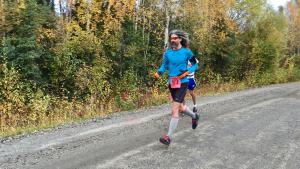
Equinox Marathon Relay leg 2, 2016
Introduction
A couple years ago I compared racing data between two races (Gold Discovery and Equinox, Santa Claus and Equinox) in the same season for all runners that ran in both events. The result was an estimate of how fast I might run the Equinox Marathon based on my times for Gold Discovery and the Santa Claus Half Marathon.
Several years have passed and I've run more races and collected more racing data for all the major Fairbanks races and wanted to run the same analysis for all combinations of races.
Data
The data comes from a database I’ve built of race times for all competitors, mostly coming from the results available from Chronotrack, but including some race results from SportAlaska.
We started by loading the required R packages and reading in all the racing data, a small subset of which looks like this.
| race | year | name | finish_time | birth_year | sex |
|---|---|---|---|---|---|
| Beat Beethoven | 2015 | thomas mcclelland | 00:21:49 | 1995 | M |
| Equinox Marathon | 2015 | jennifer paniati | 06:24:14 | 1989 | F |
| Equinox Marathon | 2014 | kris starkey | 06:35:55 | 1972 | F |
| Midnight Sun Run | 2014 | kathy toohey | 01:10:42 | 1960 | F |
| Midnight Sun Run | 2016 | steven rast | 01:59:41 | 1960 | M |
| Equinox Marathon | 2013 | elizabeth smith | 09:18:53 | 1987 | F |
| ... | ... | ... | ... | ... | ... |
Next we loaded in the names and distances of the races and combined this with the individual racing data. The data from Chronotrack doesn’t include the mileage and we will need that to calculate pace (minutes per mile).
My database doesn’t have complete information about all the racers that competed, and in some cases the information for a runner in one race conflicts with the information for the same runner in a different race. In order to resolve this, we generated a list of runners, grouped by their name, and threw out racers where their name matches but their gender was reported differently from one race to the next. Please understand we’re not doing this to exclude those who have changed their gender identity along the way, but to eliminate possible bias from data entry mistakes.
Finally, we combined the racers with the individual racing data, substituting our corrected runner information for what appeared in the individual race’s data. We also calculated minutes per mile (pace) and the age of the runner during the year of the race (age). Because we’re assigning a birth year to the minimum reported year from all races, our age variable won’t change during the running season, which is closer to the way age categories are calculated in Europe. Finally, we removed results where pace was greater than 20 minutes per mile for races longer than ten miles, and greater than 16 minute miles for races less than ten miles. These are likely to be outliers, or competitors not running the race.
| name | birth_year | gender | race_str | year | miles | minutes | pace | age |
|---|---|---|---|---|---|---|---|---|
| aaron austin | 1983 | M | midnight_sun_run | 2014 | 6.2 | 50.60 | 8.16 | 31 |
| aaron bravo | 1999 | M | midnight_sun_run | 2013 | 6.2 | 45.26 | 7.30 | 14 |
| aaron bravo | 1999 | M | midnight_sun_run | 2014 | 6.2 | 40.08 | 6.46 | 15 |
| aaron bravo | 1999 | M | midnight_sun_run | 2015 | 6.2 | 36.65 | 5.91 | 16 |
| aaron bravo | 1999 | M | midnight_sun_run | 2016 | 6.2 | 36.31 | 5.85 | 17 |
| aaron bravo | 1999 | M | spruce_tree_classic | 2014 | 6.0 | 42.17 | 7.03 | 15 |
| ... | ... | ... | ... | ... | ... | ... | ... | ... |
We combined all available results for each runner in all years they participated such that the resulting rows are grouped by runner and year and columns are the races themselves. The values in each cell represent the pace for the runner × year × race combination.
For example, here’s the first six rows for runners that completed Beat Beethoven and the Chena River Run in the years I have data. I also included the column for the Midnight Sun Run in the table, but the actual data has a column for all the major Fairbanks races. You’ll see that two of the six runners listed ran BB and CRR but didn’t run MSR in that year.
| name | gender | age | year | beat_beethoven | chena_river_run | midnight_sun_run |
|---|---|---|---|---|---|---|
| aaron schooley | M | 36 | 2016 | 8.19 | 8.15 | 8.88 |
| abby fett | F | 33 | 2014 | 10.68 | 10.34 | 11.59 |
| abby fett | F | 35 | 2016 | 11.97 | 12.58 | NA |
| abigail haas | F | 11 | 2015 | 9.34 | 8.29 | NA |
| abigail haas | F | 12 | 2016 | 8.48 | 7.90 | 11.40 |
| aimee hughes | F | 43 | 2015 | 11.32 | 9.50 | 10.69 |
| ... | ... | ... | ... | ... | ... | ... |
With this data, we build a whole series of linear models, one for each race combination. We created a series of formula strings and objects for all the combinations, then executed them using map(). We combined the start and predicted race names with the linear models, and used glance() and tidy() from the broom package to turn the models into statistics and coefficients.
All of the models between races were highly significant, but many of them contain coefficients that aren’t significantly different than zero. That means that including that term (age, gender or first race pace) isn’t adding anything useful to the model. We used the significance of each term to reduce our models so they only contained coefficients that were significant and regenerated the statistics and coefficients for these reduced models.
The full R code appears at the bottom of this post.
Results
Here’s the statistics from the ten best performing models (based on R² ).
| start_race | predicted_race | n | R² | p-value |
|---|---|---|---|---|
| run_of_the_valkyries | golden_heart_trail_run | 40 | 0.956 | 0 |
| golden_heart_trail_run | equinox_marathon | 36 | 0.908 | 0 |
| santa_claus_half_marathon | golden_heart_trail_run | 34 | 0.896 | 0 |
| midnight_sun_run | gold_discovery_run | 139 | 0.887 | 0 |
| beat_beethoven | golden_heart_trail_run | 32 | 0.886 | 0 |
| run_of_the_valkyries | gold_discovery_run | 44 | 0.877 | 0 |
| midnight_sun_run | golden_heart_trail_run | 52 | 0.877 | 0 |
| gold_discovery_run | santa_claus_half_marathon | 111 | 0.876 | 0 |
| chena_river_run | golden_heart_trail_run | 44 | 0.873 | 0 |
| run_of_the_valkyries | santa_claus_half_marathon | 91 | 0.851 | 0 |
It’s interesting how many times the Golden Heart Trail Run appears on this list since that run is something of an outlier in the Usibelli running series because it’s the only race entirely on trails. Maybe it’s because it’s distance (5K) is comparable with a lot of the earlier races in the season, but because it’s on trails it matches well with the later races that are at least partially on trails like Gold Discovery or Equinox.
Here are the ten worst models.
| start_race | predicted_race | n | R² | p-value |
|---|---|---|---|---|
| midnight_sun_run | equinox_marathon | 431 | 0.525 | 0 |
| beat_beethoven | hoodoo_half_marathon | 87 | 0.533 | 0 |
| beat_beethoven | midnight_sun_run | 818 | 0.570 | 0 |
| chena_river_run | equinox_marathon | 196 | 0.572 | 0 |
| equinox_marathon | hoodoo_half_marathon | 90 | 0.584 | 0 |
| beat_beethoven | equinox_marathon | 265 | 0.585 | 0 |
| gold_discovery_run | hoodoo_half_marathon | 41 | 0.599 | 0 |
| beat_beethoven | santa_claus_half_marathon | 163 | 0.612 | 0 |
| run_of_the_valkyries | equinox_marathon | 125 | 0.642 | 0 |
| midnight_sun_run | hoodoo_half_marathon | 118 | 0.657 | 0 |
Most of these models are shorter races like Beat Beethoven or the Chena River Run predicting longer races like Equinox or one of the half marathons. Even so, each model explains more than half the variation in the data, which isn’t terrible.
Application
Now that we have all our models and their coefficients, we used these models to make predictions of future performance. I’ve written an online calculator based on the reduced models that let you predict your race results as you go through the running season. The calculator is here: Fairbanks Running Race Converter.
For example, I ran a 7:41 pace for Run of the Valkyries this year. Entering that, plus my age and gender into the converter predicts an 8:57 pace for the first running of the HooDoo Half Marathon. The R² for this model was a respectable 0.71 even though only 23 runners ran both races this year (including me). My actual pace for HooDoo was 8:18, so I came in quite a bit faster than this. No wonder my knee and hip hurt after the race! Using my time from the Golden Heart Trail Run, the converter predicts a HooDoo Half pace of 8:16.2, less than a minute off my 1:48:11 finish.
Appendix: R code
library(tidyverse)
library(lubridate)
library(broom)

races_db <- src_postgres(host="localhost", dbname="races")

combined_races <- tbl(races_db, build_sql(
    "SELECT race, year, lower(name) AS name, finish_time,
        year - age AS birth_year, sex
     FROM chronotrack
     UNION
     SELECT race, year, lower(name) AS name, finish_time,
        birth_year,
        CASE WHEN age_class ~ 'M' THEN 'M' ELSE 'F' END AS sex
     FROM sportalaska
     UNION
     SELECT race, year, lower(name) AS name, finish_time,
        NULL AS birth_year, NULL AS sex
     FROM other"))

races <- tbl(races_db, build_sql(
    "SELECT race,
        lower(regexp_replace(race, '[ ’]', '_', 'g')) AS race_str,
        date_part('year', date) AS year,
        miles
     FROM races"))

racing_data <- combined_races %>%
    inner_join(races) %>%
    filter(!is.na(finish_time))

racers <- racing_data %>%
    group_by(name) %>%
    summarize(races=n(),
              birth_year=min(birth_year),
              gender_filter=ifelse(sum(ifelse(sex=='M',1,0))==
                                   sum(ifelse(sex=='F',1,0)),
                                   FALSE, TRUE),
              gender=ifelse(sum(ifelse(sex=='M',1,0))>
                            sum(ifelse(sex=='F',1,0)),
                            'M', 'F')) %>%
    ungroup() %>%
    filter(gender_filter) %>%
    select(-gender_filter)

racing_data_filled <- racing_data %>%
    inner_join(racers, by="name") %>%
    mutate(birth_year=birth_year.y) %>%
    select(name, birth_year, gender, race_str, year, miles, finish_time) %>%
    group_by(name, race_str, year) %>%
    mutate(n=n()) %>%
    filter(!is.na(birth_year), n==1) %>%
    ungroup() %>%
    collect() %>%
    mutate(fixed=ifelse(grepl('[0-9]+:[0-9]+:[0-9.]+', finish_time),
                        finish_time,
                        paste0('00:', finish_time)),
           minutes=as.numeric(seconds(hms(fixed)))/60.0,
           pace=minutes/miles,
           age=year-birth_year,
           age_class=as.integer(age/10)*10,
           group=paste0(gender, age_class),
           gender=as.factor(gender)) %>%
    filter((miles<10 & pace<16) | (miles>=10 & pace<20)) %>%
    select(-fixed, -finish_time, -n)

speeds_combined <- racing_data_filled %>%
    select(name, gender, age, age_class, group, race_str, year, pace) %>%
    spread(race_str, pace)

main_races <- c('beat_beethoven', 'chena_river_run', 'midnight_sun_run',
                'run_of_the_valkyries', 'gold_discovery_run',
                'santa_claus_half_marathon', 'golden_heart_trail_run',
                'equinox_marathon', 'hoodoo_half_marathon')

race_formula_str <-
    lapply(seq(1, length(main_races)-1),
           function(i)
               lapply(seq(i+1, length(main_races)),
                      function(j) paste(main_races[[j]], '~',
                                        main_races[[i]],
                                        '+ gender', '+ age'))) %>%
    unlist()

race_formulas <- lapply(race_formula_str, function(i) as.formula(i)) %>%
    unlist()

lm_models <- map(race_formulas, ~ lm(.x, data=speeds_combined))

models <- tibble(start_race=factor(gsub('.* ~ ([^ ]+).*',
                                        '\\1',
                                        race_formula_str),
                                   levels=main_races),
                 predicted_race=factor(gsub('([^ ]+).*',
                                            '\\1',
                                            race_formula_str),
                                       levels=main_races),
                 lm_models=lm_models) %>%
    arrange(start_race, predicted_race)

model_stats <- glance(models %>% rowwise(), lm_models)
model_coefficients <- tidy(models %>% rowwise(), lm_models)

reduced_formula_str <- model_coefficients %>%
    ungroup() %>%
    filter(p.value<0.05, term!='(Intercept)') %>%
    mutate(term=gsub('genderM', 'gender', term)) %>%
    group_by(predicted_race, start_race) %>%
    summarize(independent_vars=paste(term, collapse=" + ")) %>%
    ungroup() %>%
    transmute(reduced_formulas=paste(predicted_race, independent_vars, sep=' ~ '))

reduced_formula_str <- reduced_formula_str$reduced_formulas

reduced_race_formulas <- lapply(reduced_formula_str,
                                function(i) as.formula(i)) %>% unlist()

reduced_lm_models <- map(reduced_race_formulas, ~ lm(.x, data=speeds_combined))

n_from_lm <- function(model) {
    summary_object <- summary(model)

    summary_object$df[1] + summary_object$df[2]
}

reduced_models <- tibble(start_race=factor(gsub('.* ~ ([^ ]+).*', '\\1', reduced_formula_str),
                                           levels=main_races),
                         predicted_race=factor(gsub('([^ ]+).*', '\\1', reduced_formula_str),
                                               levels=main_races),
                         lm_models=reduced_lm_models) %>%
    arrange(start_race, predicted_race) %>%
    rowwise() %>%
    mutate(n=n_from_lm(lm_models))

reduced_model_stats <- glance(reduced_models %>% rowwise(), lm_models)
reduced_model_coefficients <- tidy(reduced_models %>% rowwise(), lm_models) %>%
    ungroup()

coefficients_and_stats <- reduced_model_stats %>%
    inner_join(reduced_model_coefficients,
               by=c("start_race", "predicted_race", "n")) %>%
    select(start_race, predicted_race, n, r.squared, term, estimate)

write_csv(coefficients_and_stats,
          "coefficients.csv")

make_scatterplot <- function(start_race, predicted_race) {
   age_limits <- speeds_combined %>%
      filter_(paste("!is.na(", start_race, ")"),
               paste("!is.na(", predicted_race, ")")) %>%
      summarize(min=min(age), max=max(age)) %>%
      unlist()

   q <- ggplot(data=speeds_combined,
               aes_string(x=start_race, y=predicted_race)) +
            # plasma works better with a grey background
            # theme_bw() +
            geom_abline(slope=1, color="darkred", alpha=0.5) +
            geom_smooth(method="lm", se=FALSE) +
            geom_point(aes(shape=gender, color=age)) +
            scale_color_viridis(option="plasma",
                              limits=age_limits) +
            scale_x_continuous(breaks=pretty_breaks(n=10)) +
            scale_y_continuous(breaks=pretty_breaks(n=6))

   svg_filename <- paste0(paste(start_race, predicted_race, sep="-"), ".svg")

   height <- 9
   width <- 16
   resize <- 0.75

   svg(svg_filename, height=height*resize, width=width*resize)
   print(q)
   dev.off()
}

lapply(seq(1, length(main_races)-1),
      function(i)
            lapply(seq(i+1, length(main_races)),
                  function(j)
                        make_scatterplot(main_races[[i]], main_races[[j]])
                  )
Introduction
I’ve been brewing beer since the early 90s, and since those days the number of hops available to homebrewers has gone from a handfull of varieties (Northern Brewer, Goldings, Fuggle, Willamette, Cluster) to well over a hundred. Whenever I go to my local brewing store I’m bewildered by the large variety of hops, most of which I’ve never heard of. I’m also not all that fond of super-citrusy hops like Cascade or it’s variants, so it is a challenge to find flavor and aroma hops that aren’t citrusy among the several dozen new varieties on display.
Most of the hops at the store are Yakima Chief – Hop Union branded, and they’ve got a great web site that lists all their varieties and has information about each hop. As convenient as a website can be, I’d rather have the data in a database where I can search and organize it myself. Since the data is all on the website, we can use a web scraping library to grab it and format it however we like.
One note: websites change all the time, so whenever the structure of a site changes, the code to grab the data will need to be updated. I originally wrote the code for this post a couple weeks ago, scraping data from the Hop Union web site. This morning, that site had been replaced with an entirely different Yakima Chief – Hop Union site and I had to completely rewrite the code.
rvest
I’m using the rvest package from Hadley Wickham and RStudio to do the work of pulling the data from each page. In the Python world, Beautiful Soup would be the library I’d use, but there’s a fair amount of data manipulation needed here and I felt like dplyr would be easier.
Process
First, load all the libraries we need.
library(rvest)       # scraping data from the web
library(dplyr)       # manipulation, filtering, grouping into tables
library(stringr)     # string functions
library(tidyr)       # creating columns from rows
library(RPostgreSQL) # dump final result to a PostgreSQL database
Next, we retrieve the data from the main page that has all the varieties listed on it, and extract the list of links to each hop. In the code below, we read the entire document into a variable, hop_varieties using the read_html function.
Once we’ve got the web page, we need to find the HTML nodes that contain links to the page for each individual hop. To do that, we use html_nodes(), passing a CSS selector to the function. In this case, we’re looking for a tags that have a class of card__name. I figured this out by looking at the raw source code from the page using my web browser’s inspection tools. If you right-click on what looks like a link on the page, one of the options in the pop-up menu is “inspect”, and when you choose that, it will show you the HTML for the element you clicked on. It can take a few tries to find the proper combination of tag, class, attribute or id to uniquely identify the things you want.
The YCH site is pretty well organized, so this isn’t too difficult. Once we’ve got the nodes, we extract the links by retrieving the href attribute from each one with html_attr().
hop_varieties <- read_html("http://ychhops.com/varieties")

hop_page_links <- hop_varieties %>%
    html_nodes("a.card__name") %>%
    html_attr("href")
Now we have a list of links to all the varieties on the page. It turns out that they made a mistake when they transitioned to the new site and the links all have the wrong host (ych.craft.dev). We can fix that by applying replacing the host in all the links.
fixed_links <- sapply(hop_page_links,
                     FUN=function(x) sub('ych.craft.dev',
                                         'ychhops.com', x)) %>%
    as.vector()
Each page will need to be loaded, the relevant information extracted, and the data formatted into a suitable data structure. I think a data frame is the best format for this, where each row in the data frame represents the data for a single hop and each column is a piece of information from the web page.
First we write a function the retrieves the data for a single hop and returns a one-row data frame with that data. Most of the data is pretty simple, with a single value for each hop. Name, description, type of hop, etc. Where it gets more complicated is the each hop can have more than one aroma category, and the statistics for each hop vary from one to the next. What we’ve done here is combine the aromas together into a single string, using the at symbol (@) to separate the parts. Since it’s unlikely that symbol will appear in the data, we can split it back apart later. We do the same thing for the other parameters, creating an @-delimited string for the items, and their values.
get_hop_stats <- function(p) {
    hop_page <- read_html(p)

    hop_name <- hop_page %>%
        html_nodes('h1[itemprop="name"]') %>%
        html_text()

    type <- hop_page %>%
        html_nodes('div.hop-profile__data div[itemprop="additionalProperty"]') %>%
        html_text()
    type <- (str_split(type, ' '))[[1]][2]

    region <- hop_page %>%
        html_nodes('div.hop-profile__data h5') %>%
        html_text()

    description <- hop_page %>%
        html_nodes('div.hop-profile__profile p[itemprop="description"]') %>%
        html_text()

    aroma_profiles <- hop_page %>%
        html_nodes('div.hop-profile__profile h3.headline a[itemprop="category"]') %>%
        html_text()

    aroma_profiles <- sapply(aroma_profiles,
                             FUN=function(x) sub(',$', '', x)) %>%
        as.vector() %>%
        paste(collapse="@")

    composition_keys <- hop_page %>%
        html_nodes('div.hop-composition__item') %>%
        html_text()

    composition_keys <- sapply(composition_keys,
                               FUN=function(x)
                                   tolower(gsub('[ -]', '_', x))) %>%
        as.vector() %>%
        paste(collapse="@")

    composition_values <- hop_page %>%
        html_nodes('div.hop-composition__value') %>%
        html_text() %>%
        paste(collapse="@")

    hop <- data.frame('hop'=hop_name, 'type'=type, 'region'=region,
                      'description'=description,
                      'aroma_profiles'=aroma_profiles,
                      'composition_keys'=composition_keys,
                      'composition_values'=composition_values)

}
With a function that takes a URL as input, and returns a single-row data frame, we use a common idiom in R to combine everything together. The inner-most lapply function will run the function on each of the fixed variety links, and each single-row data frame will then be combined together using rbind within do.call.
all_hops <- do.call(rbind,
                    lapply(fixed_links, get_hop_stats)) %>% tbl_df() %>%
    arrange(hop) %>%
    mutate(id=row_number())
At this stage we’ve retrieved all the data from the website, but some of it has been encoded in a less that useful format.
Data tidying
To tidy the data, we want to extract only a few of the item / value pairs of data from the data frame, alpha acid, beta acid, co-humulone and total oil. We also need to remove carriage returns from the description and remove the aroma column.
We split the keys and values back apart again using the @ symbol used earlier to combine them, then use unnest to create duplicate columns with each of the key / value pairs in them. spread pivots these up into columns such that the end result has one row per hop with the relevant composition values as columns in the tidy data set.
hops <- all_hops %>%
    arrange(hop) %>%
    mutate(description=gsub('\\r', '', description),
           keys=str_split(composition_keys, "@"),
           values=str_split(composition_values, "@")) %>%
    unnest(keys, values) %>%
    spread(keys, values) %>%
    select(id, hop, type, region, alpha_acid, beta_acid, co_humulone, total_oil, description)

kable(hops %>% select(id, hop, type, region, alpha_acid) %>% head())
| id | hop | type | region | alpha_acid |
|---|---|---|---|---|
| 1 | Admiral | Bittering | United Kingdom | 13 - 16% |
| 2 | Ahtanum™ | Aroma | Pacific Northwest | 3.5 - 6.5% |
| 3 | Amarillo® | Aroma | Pacific Northwest | 7 - 11% |
| 4 | Aramis | Aroma | France | 7.9 - 8.3% |
| 5 | Aurora | Dual | Slovenia | 7 - 9.5% |
| 6 | Bitter Gold | Dual | Pacific Northwest | 12 - 14.5% |
For the aromas we have a one to many relationship where each hop has one or more aroma categories associated. We could fully normalize this by created an aroma table and a join table that connects hop and aroma, but this data is simple enough that I just created the join table itself. We’re using the same str_split / unnest method we used before, except that in this case we don't want to turn those into columns, we want a separate row for each hop × aroma combination.
hops_aromas <- all_hops %>%
    select(id, hop, aroma_profiles) %>%
    mutate(aroma=str_split(aroma_profiles, "@")) %>%
    unnest(aroma) %>%
    select(id, hop, aroma)
Saving and exporting
Finally, we save the data and export it into a PostgreSQL database.
save(list=c("hops", "hops_aromas"),
     file="ych_hops.rdata")

beer <- src_postgres(host="dryas.swingleydev.com", dbname="beer",
                     port=5434, user="cswingle")

dbWriteTable(beer$con, "ych_hops", hops %>% data.frame(), row.names=FALSE)
dbWriteTable(beer$con, "ych_hops_aromas", hops_aromas %>% data.frame(), row.names=FALSE)
Usage
I created a view in the database that combines all the aroma categories into a Postgres array type using this query. I also use a pair of regular expressions to convert the alpha acid string into a Postgres numrange.
CREATE VIEW ych_basic_hop_data AS
SELECT ych_hops.id, ych_hops.hop, array_agg(aroma) AS aromas, type,
    numrange(
        regexp_replace(alpha_acid, '([0-9.]+).*', E'\\1')::numeric,
        regexp_replace(alpha_acid, '.*- ([0-9.]+)%', E'\\1')::numeric,
        '[]') AS alpha_acid_percent, description
FROM ych_hops
    INNER JOIN ych_hops_aromas USING(id)
GROUP BY ych_hops.id, ych_hops.hop, type, alpha_acid, description
ORDER BY hop;
With this, we can, for example, find US aroma hops that are spicy, but without citrus using the ANY() and ALL() array functions.
SELECT hop, region, type, aromas, alpha_acid_percent
FROM ych_basic_hop_data
WHERE type = 'Aroma' AND region = 'Pacific Northwest' AND 'Spicy' = ANY(aromas)
AND 'Citrus' != ALL(aromas) ORDER BY alpha_acid_percent;

     hop    |      region       | type  |            aromas            | alpha_acid_percent
 -----------+-------------------+-------+------------------------------+--------------------
  Crystal   | Pacific Northwest | Aroma | {Floral,Spicy}               | [3,6]
  Hallertau | Pacific Northwest | Aroma | {Floral,Spicy,Herbal}        | [3.5,6.5]
  Tettnang  | Pacific Northwest | Aroma | {Earthy,Floral,Spicy,Herbal} | [4,6]
  Mt. Hood  | Pacific Northwest | Aroma | {Spicy,Herbal}               | [4,6.5]
  Santiam   | Pacific Northwest | Aroma | {Floral,Spicy,Herbal}        | [6,8.5]
  Ultra     | Pacific Northwest | Aroma | {Floral,Spicy}               | [9.2,9.7]
Code
The RMarkdown version of this post, including the code can be downloaded from GitHub:
Since the middle of 2010 we’ve been monitoring the level of Goldstream Creek for the National Weather Service by measuring the distance from the top of our bridge to the surface of the water or ice. In 2012 the Creek flooded and washed the bridge downstream. We eventually raised the bridge logs back up onto the banks and resumed our measurements.
This winter the Creek had been relatively quiet, with the level hovering around eight feet below the bridge. But last Friday, we awoke to more than four feet of water over the ice, and since then it's continued to rise. This morning’s reading had the ice only 3.17 feet below the surface of the bridge.
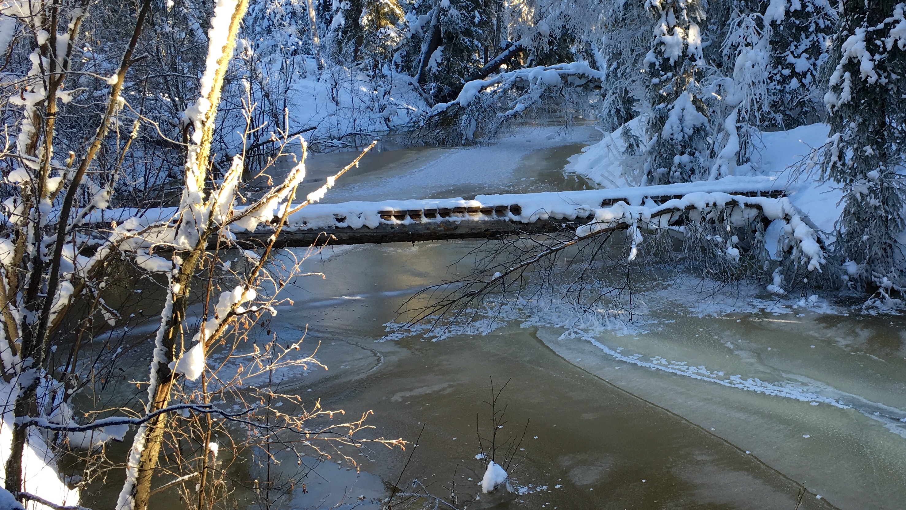
Overflow within a few feet of the bridge
Water also entered the far side of the slough, and is making it’s way around the loop, melting the snow covering the old surface. Even as the main channel stops rising and freezes, water moves closer to the dog yard from the slough.
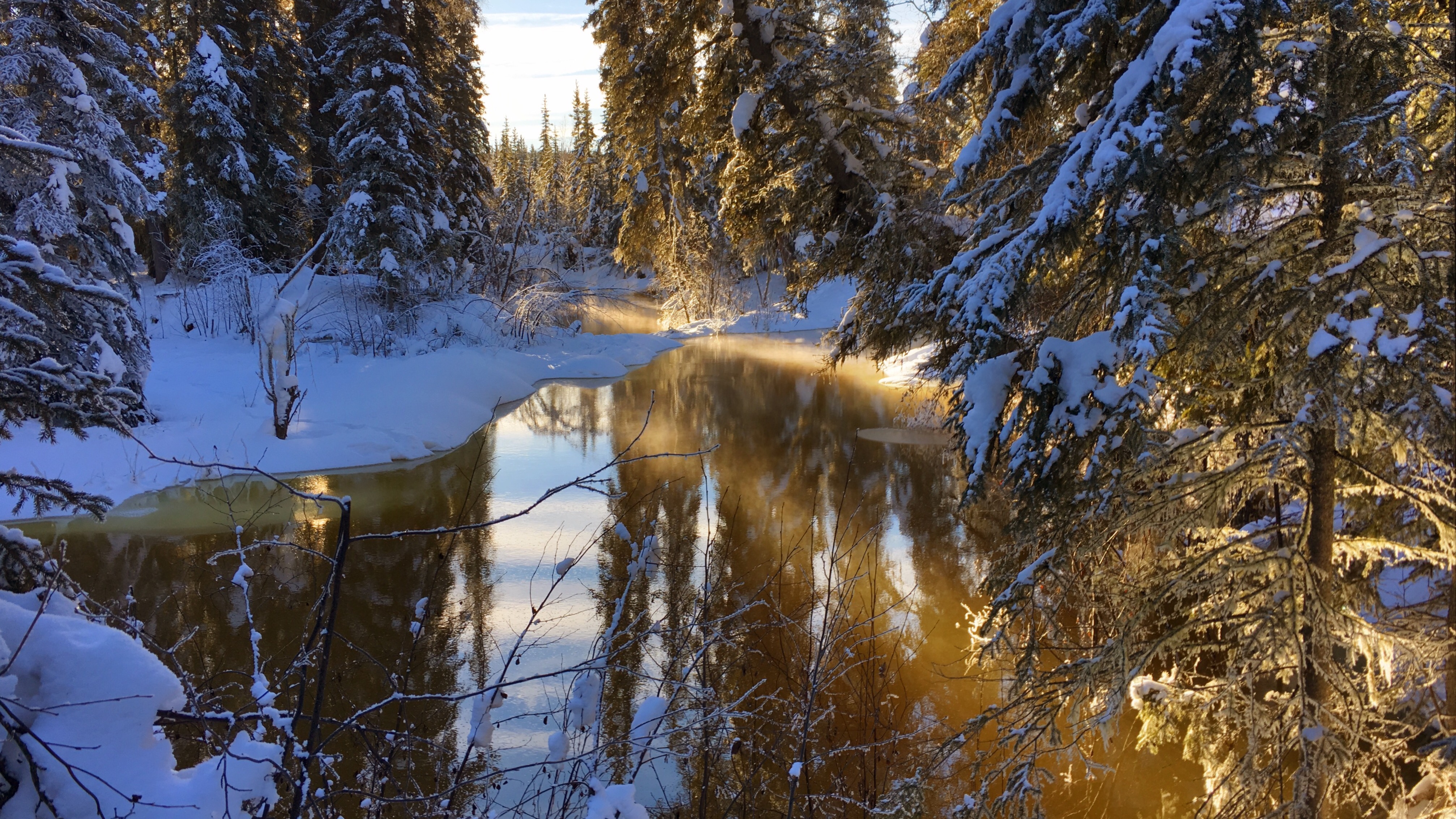
Water entering the slough
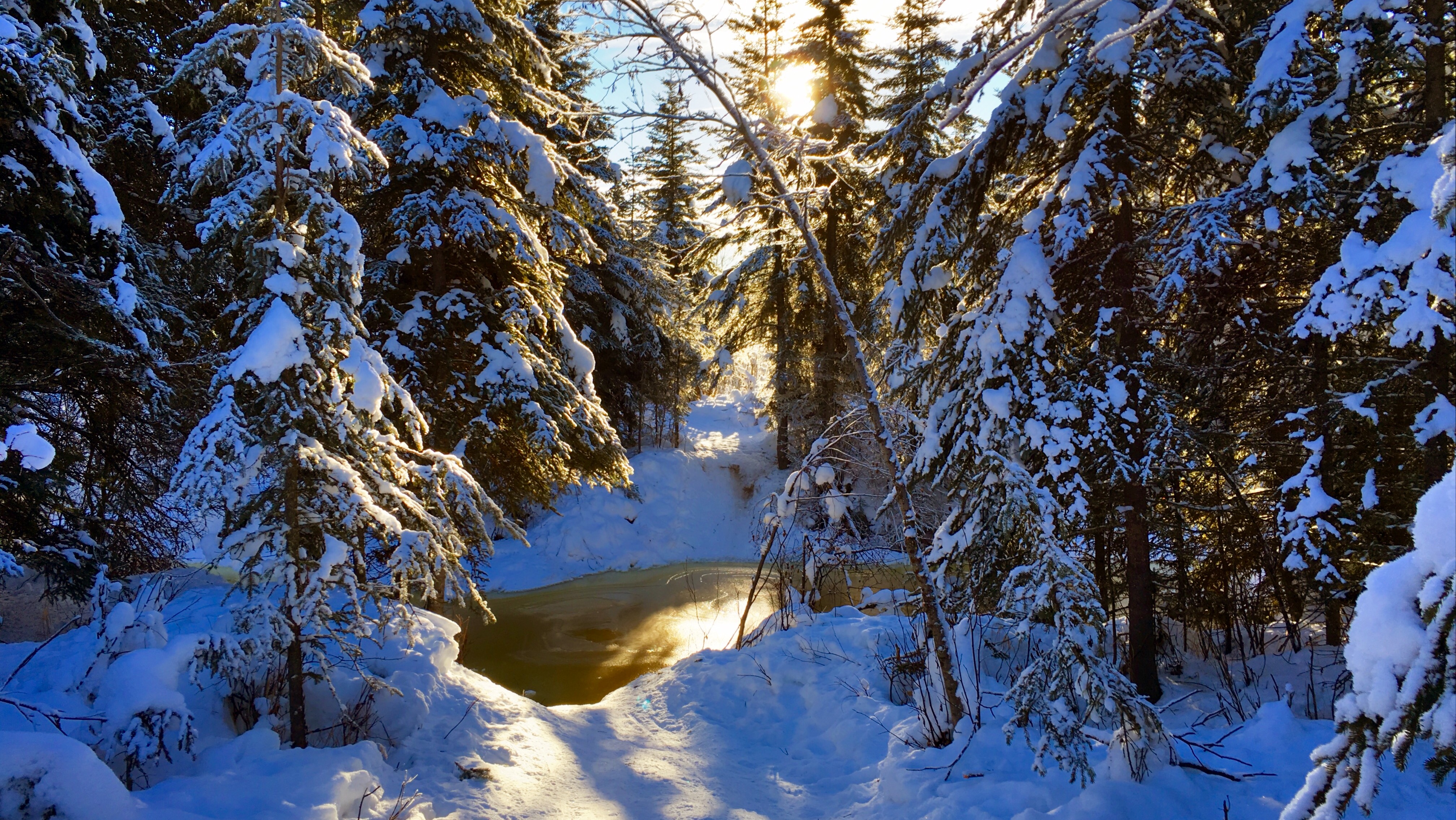
One of my longer commutes to work involves riding east on the Goldstream Valley trails, crossing the Creek by Ballaine Road, then riding back toward the house on the north side of the Creek. From there, I can cross Goldstream Creek again where the trail at the end of Miller Hill Road and the Miller Hill Extension trail meet, and ride the trails the rest of the way to work. That crossing is also covered with several feet of water and ice.
Trail crossing at the end of Miller Hill
Yesterday one of my neighbors sent email with the subject line, “Are we doomed?,” so I took a look at the heigh data from past years. The plot below shows the height of the Creek, as measured from the surface of the bridge (click on the plot to view or download a PDF, R code used to generate the plot appears at the bottom of this post).
The orange region is the region where the Creek is flowing; between my reporting of 0% ice in spring and 100% ice-covered in fall. The data gap in July 2014 was due to the flood washing the bridge downstream. Because the bridge isn’t in the same location, the height measurements before and after the flood aren’t completely comparable, but I don’t have the data for the difference in elevation between the old and new bridge locations, so this is the best we’ve got.

Creek heights by year
The light blue line across all the plots shows the current height of the Creek (3.17 feet) for all years of data. 2012 is probably the closest year to our current situation where the Creek rose to around five feet below the bridge in early January. But really nothing is completely comparable to the situation we’re in right now. Breakup won’t come for another two or three months, and in most years, the Creek rises several feet between February and breakup.
Time will tell, of course, but here’s why I’m not too worried about it. There’s another bridge crossing several miles downstream, and last Friday there was no water on the surface, and the Creek was easily ten feet below the banks. That means that there is a lot of space within the banks of the Creek downstream that can absorb the melting water as breakup happens. I also think that there is a lot of liquid water trapped beneath the ice on the surface in our neighborhood and that water is likely to slowly drain out downstream, leaving a lot of empty space below the surface ice that can accommodate further overflow as the winter progresses. In past years of walking on the Creek I’ve come across huge areas where the top layer of ice dropped as much as six feet when the water underneath drained away. I’m hoping that this happens here, with a lot of the subsurface water draining downstream.
The Creek is always reminding us of how little we really understand what’s going on and how even a small amount of flowing water can become a huge force when that water accumulates more rapidly than the Creek can handle it. Never a dull moment!
Code
library(readr)
library(dplyr)
library(tidyr)
library(lubridate)
library(ggplot2)
library(scales)

wxcoder <- read_csv("data/wxcoder.csv", na=c("-9999"))
feb_2016_incomplete <- read_csv("data/2016_02_incomplete.csv",
                                na=c("-9999"))

wxcoder <- rbind(wxcoder, feb_2016_incomplete)

wxcoder <- wxcoder %>%
   transmute(dte=as.Date(ymd(DATE)), tmin_f=TN, tmax_f=TX, tobs_f=TA,
             tavg_f=(tmin_f+tmax_f)/2.0,
             prcp_in=ifelse(PP=='T', 0.005, as.numeric(PP)),
             snow_in=ifelse(SF=='T', 0.05, as.numeric(SF)),
             snwd_in=SD, below_bridge_ft=HG,
             ice_cover_pct=IC)

creek <- wxcoder %>% filter(dte>as.Date(ymd("2010-05-27")))

creek_w_year <- creek %>%
   mutate(year=year(dte),
         doy=yday(dte))

ice_free_date <- creek_w_year %>%
   group_by(year) %>%
   filter(ice_cover_pct==0) %>%
   summarize(ice_free_dte=min(dte), ice_free_doy=min(doy))

ice_covered_date <- creek_w_year %>%
   group_by(year) %>%
   filter(ice_cover_pct==100, doy>182) %>%
   summarize(ice_covered_dte=min(dte), ice_covered_doy=min(doy))

flowing_creek_dates <- ice_free_date %>%
   inner_join(ice_covered_date, by="year") %>%
   mutate(ymin=Inf, ymax=-Inf)

latest_obs <- creek_w_year %>%
   mutate(rank=rank(desc(dte))) %>%
   filter(rank==1)

current_height_df <- data.frame(
      year=c(2011, 2012, 2013, 2014, 2015, 2016),
      below_bridge_ft=latest_obs$below_bridge_ft)

q <- ggplot(data=creek_w_year %>% filter(year>2010),
            aes(x=doy, y=below_bridge_ft)) +
   theme_bw() +
   geom_rect(data=flowing_creek_dates %>% filter(year>2010),
             aes(xmin=ice_free_doy, xmax=ice_covered_doy, ymin=ymin, ymax=ymax),
             fill="darkorange", alpha=0.4,
             inherit.aes=FALSE) +
   # geom_point(size=0.5) +
   geom_line() +
   geom_hline(data=current_height_df,
              aes(yintercept=below_bridge_ft),
              colour="darkcyan", alpha=0.4) +
   scale_x_continuous(name="",
                      breaks=c(1,32,60,91,
                               121,152,182,213,
                               244,274,305,335,
                               365),
                      labels=c("Jan", "Feb", "Mar", "Apr",
                               "May", "Jun", "Jul", "Aug",
                               "Sep", "Oct", "Nov", "Dec",
                               "Jan")) +
   scale_y_reverse(name="Creek height, feet below bridge",
                   breaks=pretty_breaks(n=5)) +
   facet_wrap(~ year, ncol=1)

width <- 16
height <- 16
rescale <- 0.75
pdf("creek_heights_2010-2016_by_year.pdf",
    width=width*rescale, height=height*rescale)
print(q)
dev.off()
svg("creek_heights_2010-2016_by_year.svg",
    width=width*rescale, height=height*rescale)
print(q)
dev.off()