Introduction
I’m planning a short trip to visit family in Florida and thought I’d take advantage of being in a new place to do some late winter backpacking where it’s warmer than in Fairbanks. I think I’ve settled on a 3‒5 day backpacking trip in Big South Fork National River and Recreation Area, which is in northeastern Tennesee and southeastern Kentucky.
Except for a couple summer trips in New England in the 80s, my backpacking experience has been in summer, in places where it doesn’t rain much and is typically hot and dry (California, Oregon). So I’d like to find out what the weather should be like when I’m there.
Data
I’ll use the Global Historical Climatology Network — Daily dataset, which contains daily weather observations for more than 100 thousand stations across the globe. There are more than 26 thousand active stations in the United States, and data for some U.S. stations goes back to 1836. I loaded the entire dataset—2.4 billion records as of last week—into a PostgreSQL database, partitioning the data by year. I’m interested in daily minimum and maximum temperature (TMIN, TMAX), precipitation (PRCP) and snowfall (SNOW), and in stations within 50 miles of the center of the recreation area.
The following map shows the recreation area boundary (with some strange drawing errors, probably due to using the fortify command) in green, the Tennessee/Kentucky border across the middle of the plot, and the 19 stations used in the analysis.

Here are the details on the stations:
| station_id | station_name | start_year | end_year | latitude | longitude | miles |
|---|---|---|---|---|---|---|
| USC00407141 | PICKETT SP | 2000 | 2017 | 36.5514 | -84.7967 | 6.13 |
| USC00406829 | ONEIDA | 1959 | 2017 | 36.5028 | -84.5308 | 9.51 |
| USC00400081 | ALLARDT | 1928 | 2017 | 36.3806 | -84.8744 | 12.99 |
| USC00404590 | JAMESTOWN | 2003 | 2017 | 36.4258 | -84.9419 | 14.52 |
| USC00157677 | STEARNS 2S | 1936 | 2017 | 36.6736 | -84.4792 | 16.90 |
| USC00401310 | BYRDSTOWN | 1998 | 2017 | 36.5803 | -85.1256 | 24.16 |
| USC00406493 | NEWCOMB | 1999 | 2017 | 36.5517 | -84.1728 | 29.61 |
| USC00158711 | WILLIAMSBURG 1NW | 2011 | 2017 | 36.7458 | -84.1753 | 33.60 |
| USC00405332 | LIVINGSTON RADIO WLIV | 1961 | 2017 | 36.3775 | -85.3364 | 36.52 |
| USC00154208 | JAMESTOWN WWTP | 1971 | 2017 | 37.0056 | -85.0617 | 39.82 |
| USC00406170 | MONTEREY | 1904 | 2017 | 36.1483 | -85.2650 | 40.04 |
| USC00406619 | NORRIS | 1936 | 2017 | 36.2131 | -84.0603 | 41.13 |
| USC00402202 | CROSSVILLE ED & RESEARCH | 1912 | 2017 | 36.0147 | -85.1314 | 41.61 |
| USW00053868 | OAK RIDGE ASOS | 1999 | 2017 | 36.0236 | -84.2375 | 42.24 |
| USC00401561 | CELINA | 1948 | 2017 | 36.5408 | -85.4597 | 42.31 |
| USC00157510 | SOMERSET 2 N | 1950 | 2017 | 37.1167 | -84.6167 | 42.36 |
| USW00003841 | OAK RIDGE ATDD | 1948 | 2017 | 36.0028 | -84.2486 | 43.02 |
| USW00003847 | CROSSVILLE MEM AP | 1954 | 2017 | 35.9508 | -85.0814 | 43.87 |
| USC00404871 | KINGSTON | 2000 | 2017 | 35.8575 | -84.5278 | 45.86 |
To perform the analysis, I collected all valid observations for the stations listed, then reduced the results, including observations where the day of the year was between 45 and 52 (February 14‒21).
| variable | observations |
|---|---|
| PRCP | 5,942 |
| SNOW | 5,091 |
| TMAX | 4,900 |
| TMIN | 4,846 |
Results
Temperature
We will consider temperature first. The following two plots show the distribution of daily minimum and maximum temperatures. In both plots, the bars represent the number of observations at that temperature, the vertical red line through the middle of the plot shows the average temperature, and the light orange and blue sections show the ranges of temperatures enclosing 80% and 98% of the data.


The minimum daily temperature figure shows that the average minimum temperature is below freezing, (28.9 °F) and eighty percent of all days in the third week of February were between 15 and 43 °F (the light orange region). The minimum temperature was colder than 15 °F or warmer than 54 °F 2% of the time (the light blue region). Maximum daily temperature was an average of 51 °F, and was rarely below freezing or above 72 °F.
Another way to look at this sort of data is to count particular occurances and divide by the total, “binning” the data into groups. Here we look at the number of days that were below freezing, colder than 20 °F or colder than 10 °F.
| temperature | observed days | percent chance |
|---|---|---|
| below freezing | 3,006 | 62.0 |
| colder than 20 | 1,079 | 22.3 |
| colder than 10 | 203 | 4.2 |
| TOTAL | 4,846 | 100.0 |
What about the daily maximum temperature?
| temperature | observed days | percent chance |
|---|---|---|
| colder than 20 | 22 | 0.4 |
| below freezing | 371 | 7.6 |
| below 40 | 1,151 | 23.5 |
| above 50 | 2,569 | 52.4 |
| above 60 | 1,157 | 23.6 |
| above 70 | 80 | 1.6 |
| TOTAL | 4,900 | 100.0 |
The chances of it being below freezing during the day are pretty slim, and more than half the time it’s warmer than 50 °F, so even if it’s cold at night, I should be able to get plenty warm hiking during the day.
Precipitation
How often it rains, and how much falls when it does is also important for planning a successful backpacking trip. Most of my backpacking has been done in the summer in California, where rainfall is rare and even when it does rain, it’s typically over quickly. Daily weather data can’t tell us about the hourly pattern of rainfall, but we can find out how often and how much it has rained in the past.
| rainfall amount | observed days | percent chance |
|---|---|---|
| raining | 2,375 | 40.0 |
| tenth | 1,610 | 27.1 |
| quarter | 1,136 | 19.1 |
| half | 668 | 11.2 |
| inch | 308 | 5.2 |
| TOTAL | 5,942 | 100.0 |
This data shows that the chance of rain on any given day between February 14th and the 21st is 40%, and the chance of getting at least a tenth of an inch is 30%. That’s certainly higher than in the Sierra Nevada in July, although by August, afternoon thunderstorms are more common in the mountains.
When there is precipitation, the distribution of precipitation totals looks like this:
| cumulative frequency | precipition |
|---|---|
| 1% | 0.01 |
| 5% | 0.02 |
| 10% | 0.02 |
| 25% | 0.07 |
| 50% | 0.22 |
| 75% | 0.59 |
| 90% | 1.18 |
| 95% | 1.71 |
| 99% | 2.56 |
These numbers are cumulative which means that on 1 percent of the days with precipition, there was a hundredth of an inch of liquid precipitation or less. Ten percent of the days had 0.02 inches or less. And 50 percent of rainy days had 0.22 inches or liquid precipitation or less. Reading the numbers from the top of the distribution, there was more than an inch of rain 10 percent of the days on which it rained, which is a little disturbing.
One final question about precipitation is how long it rains once it starts raining? Do we get little showers here and there, or are there large storms that dump rain for days without a break? To answer this question, I counted the number of days between zero-rainfall days, which is equal to the number of consecutive days where it rained.
| consecutive days | percent chance |
|---|---|
| 1 | 53.0 |
| 2 | 24.4 |
| 3 | 11.9 |
| 4 | 7.5 |
| 5 | 2.2 |
| 6 | 0.9 |
| 7 | 0.1 |
The results show that more than half the time, a single day of rain is followed by at least one day without. And the chances of having it rain every day of a three day trip to this area in mid-February is 11.9%.
Snowfall
Repeating the precipitation analysis with snowfall:
| snowfall amount | observed days | percent chance |
|---|---|---|
| snowing | 322 | 6.3 |
| inch | 148 | 2.9 |
| two | 115 | 2.3 |
| TOTAL | 5,091 | 100.0 |
Snowfall isn’t common on these dates, but it did happen, so I will need to be prepared for it. Also, the PRCP variable includes melted snow, so a small portion of the precipitation from the previous section overlaps with the snowfall shown here.
Conclusion
Based on this analysis, a 3‒5 day backpacking trip to the Big South Fork National River and Recreation area seems well within my abilities and my gear. It will almost certainly be below freezing at night, but isn’t likely to be much below 20 °F, snowfall is uncommon, and even though I will probably experience some rain, it shouldn’t be too much or carry on for the entire trip.
Appendix
The R code for this analysis appears below. I’ve loaded the GHCND data into a PostgreSQL database with observation data partitioned by year. The database tables are structured basically as they come from the National Centers for Environmental Information.
library(tidyverse)
library(dbplyr)
library(glue)
library(maps)
library(sp)
library(rgdal)
library(scales)
library(knitr)

noaa <- src_postgres(dbname = "noaa")

biso_stations <- noaa %>%
    tbl(build_sql(
        "WITH inv AS (
            SELECT station_id, max(start_year) AS start_year,
                min(end_year) AS end_year,
                array_agg(variable::text) AS variables
            FROM ghcnd_inventory
            WHERE variable IN ('TMIN', 'TMAX', 'PRCP', 'SNOW')
            GROUP BY station_id)
         SELECT station_id, station_name, start_year, end_year,
            latitude, longitude,
            ST_Distance(ST_Transform(a.the_geom, 32617),
                        ST_Transform(b.the_geom, 32617))/1609 AS miles
         FROM ghcnd_stations AS a
            INNER JOIN inv USING(station_id),
            (SELECT ST_SetSRID(
                ST_MakePoint(-84.701553,
                              36.506800), 4326) AS the_geom) AS b
         WHERE inv.variables @> ARRAY['TMIN', 'TMAX', 'PRCP', 'SNOW']
            AND end_year = 2017
            AND ST_Distance(ST_Transform(a.the_geom, 32617),
                            ST_Transform(b.the_geom, 32617))/1609 < 65
         ORDER BY miles"))

start_doy <- 32  # Feb 1
end_doy <- 59    # Feb 28

ghcnd_variables <- noaa %>% tbl("ghcnd_variables")

# ghcnd_obs partitioned by year, so query by year
obs_by_year <- function(conn, year, start_doy, end_doy) {
    print(year)
    filter_start_dte <- glue("{year}-01-01")
    filter_end_dte <- glue("{year}-12-31")
    conn %>% tbl("ghcnd_obs") %>%
        inner_join(biso_stations) %>%
        inner_join(ghcnd_variables) %>%
        mutate(doy = date_part('doy', dte),
            value = raw_value * raw_multiplier) %>%
        filter(dte >= filter_start_dte,
               dte <= filter_end_dte,
               doy >= start_doy, doy <= end_doy,
               is.na(qual_flag),
               variable %in% c('TMIN', 'TMAX', 'PRCP', 'SNOW')) %>%
        select(-c(raw_value, time_of_obs, qual_flag, description,
                  raw_multiplier)) %>%
        collect()
}

feb_obs <- map_df(1968:2017, function(x)
                  obs_by_year(noaa, x, start_doy, end_doy))

# MAP
restrict_miles <- 50
biso_filtered <- biso %>%
    filter(miles < restrict_miles)

nps_boundary <- readOGR("nps_boundary.shp", verbose = FALSE)
biso_boundary <- subset(nps_boundary, UNIT_CODE == 'BISO')
biso_df <- fortify(biso_boundary) %>% tbl_df()

q <- ggplot(data = biso_filtered,
            aes(x = longitude, y = latitude)) +
    theme_bw() +
    theme(axis.text = element_blank(), axis.ticks = element_blank(),
            panel.grid = element_blank()) +
    geom_hline(yintercept = 36.6,
               colour = "darkcyan",
               size = 0.5) +
    geom_point(colour = "darkred") +
    geom_text(aes(label = str_to_title(station_name)), size = 3,
              hjust = 0.5, vjust = 0, nudge_y = 0.01) +
    geom_polygon(data = biso_df,
                 aes(x = long, y = lat),
                 fill = "darkgreen") +
    scale_x_continuous(name = "",
                       limits = c(min(biso_filtered$longitude) - 0.02,
                                  max(biso_filtered$longitude) + 0.02)) +
    scale_y_continuous(name = "",
                       limits = c(min(biso_filtered$latitude) - 0.02,
                                  max(biso_filtered$latitude) + 0.02)) +
    coord_quickmap()

print(q)

# OBS
feb_obs_filtered <- feb_obs %>%
    filter(miles < restrict_miles,
           doy >= 45, doy <= 52)  # feb 14-21

# TEMP PLOTS
tmin_rects <- tibble(pwidth = c("80", "98"),
                     xmin = quantile((feb_obs_filtered %>%
                                      filter(variable == 'TMIN'))$value*9/5+32,
                                     c(0.10, 0.01)),
                     xmax = quantile((feb_obs_filtered %>%
                                      filter(variable == 'TMIN'))$value*9/5+32,
                                     c(0.90, 0.99)),
                     ymin = -Inf, ymax = Inf)
q <- ggplot(data = feb_obs_filtered %>% filter(variable == 'TMIN'),
            aes(x = value*9/5+32)) +
    theme_bw() +
    geom_rect(data = tmin_rects %>% filter(pwidth == "98"), inherit.aes = FALSE,
              aes(xmin = xmin, xmax = xmax, ymin = ymin, ymax = ymax),
              fill = "darkcyan", alpha = 0.2) +
    geom_rect(data = tmin_rects %>% filter(pwidth == "80"), inherit.aes = FALSE,
              aes(xmin = xmin, xmax = xmax, ymin = ymin, ymax = ymax),
              fill = "darkorange", alpha = 0.2) +
    geom_vline(xintercept = mean((feb_obs_filtered %>%
                                      filter(variable == 'TMIN'))$value*9/5+32),
               colour = "red",
               size = 0.5) +
    geom_histogram(binwidth = 1) +
    scale_x_continuous(name = "Minimum temperature (°F)",
                       breaks = pretty_breaks(n = 10)) +
    scale_y_continuous(name = "Days", breaks = pretty_breaks(n = 6)) +
    ggtitle("Minimum daily temperature distribution, February 14‒21")

print(q)

max_temp_distribution <-
    quantile((feb_obs_filtered %>%
                filter(variable == 'TMAX'))$value*9/5 + 32,
    c(0.01, 0.05, 0.10, 0.25, 0.5, 0.75, 0.90, 0.95, 0.99))

tmax_rects <- tibble(pwidth = c("80", "98"),
                     xmin = quantile((feb_obs_filtered %>%
                                      filter(variable == 'TMAX'))$value*9/5+32,
                                     c(0.10, 0.01)),
                     xmax = quantile((feb_obs_filtered %>%
                                      filter(variable == 'TMAX'))$value*9/5+32,
                                     c(0.90, 0.99)),
                     ymin = -Inf, ymax = Inf)

q <- ggplot(data = feb_obs_filtered %>% filter(variable == 'TMAX'),
            aes(x = value*9/5+32)) +
    theme_bw() +
    geom_rect(data = tmax_rects %>% filter(pwidth == "98"), inherit.aes = FALSE,
              aes(xmin = xmin, xmax = xmax, ymin = ymin, ymax = ymax),
              fill = "darkcyan", alpha = 0.2) +
    geom_rect(data = tmax_rects %>% filter(pwidth == "80"), inherit.aes = FALSE,
              aes(xmin = xmin, xmax = xmax, ymin = ymin, ymax = ymax),
              fill = "darkorange", alpha = 0.2) +
    geom_vline(xintercept = mean((feb_obs_filtered %>%
                                      filter(variable == 'TMAX'))$value*9/5+32),
               colour = "red",
               size = 0.5) +
    geom_histogram(binwidth = 1) +
    scale_x_continuous(name = "Maximum temperature (°F)",
                       breaks = pretty_breaks(n = 10)) +
    scale_y_continuous(name = "Days", breaks = pretty_breaks(n = 8)) +
    ggtitle("Maximum daily temperature distribution, February 14‒21")

print(q)

# TEMP BINS
below_freezing_percent <- feb_obs_filtered %>%
    filter(variable == 'TMIN') %>%
    mutate(`below freezing` = ifelse(value < 0, 1, 0),
           `colder than 20` = ifelse(value*9/5 + 32 < 20, 1, 0),
           `colder than 10` = ifelse(value*9/5 + 32 < 10, 1, 0)) %>%
    summarize(`below freezing` = sum(`below freezing`),
              `colder than 20` = sum(`colder than 20`),
              `colder than 10` = sum(`colder than 10`),
              TOTAL = n(),
              total = n()) %>%
    gather(temperature, `observed days`, -total) %>%
    mutate(`percent chance` = `observed days` / total * 100) %>%
    select(temperature, `observed days`, `percent chance`)

kable(below_freezing_percent, digits = 1,
      align = "lrr",
      format.args = list(big.mark = ","))

# PRCP BINS
prcp_percent <- feb_obs_filtered %>%
    filter(variable == 'PRCP') %>%
    mutate(raining = ifelse(value > 0, 1, 0),
           tenth = ifelse(value > 0.1 * 25.4, 1, 0),
           quarter = ifelse(value > 0.25 * 25.4, 1, 0),
           half = ifelse(value > 0.5 * 25.4, 1, 0),
           inch = ifelse(value > 1 * 25.4, 1, 0)) %>%
    summarize(raining = sum(raining),
              tenth = sum(tenth),
              quarter = sum(quarter),
              half = sum(half),
              inch = sum(inch),
              TOTAL = n(),
              total = n()) %>%
    gather(`rainfall amount`, `observed days`, -total) %>%
    mutate(`percent chance` = `observed days` / total * 100) %>%
    select(`rainfall amount`, `observed days`, `percent chance`)

kable(prcp_percent, digits = 1,
      align = "lrr",
      format.args = list(big.mark = ","))

# PRCP DIST
prcp_cum_freq <-
    tibble(`cumulative frequency` = c("1%", "5%", "10%", "25%", "50%", "75%", "90%",
                                      "95%", "99%"),
       precipition = quantile((feb_obs_filtered %>% filter(variable == "PRCP",
                                                           value > 0))$value/25.4,
                              c(0.01, 0.05, 0.10, 0.25, 0.5, 0.75, 0.90, 0.95, 0.99)))

kable(prcp_cum_freq, digits = 2, align="lr")

# PRCP PATTERN
no_prcp <- feb_obs %>% filter(variable == 'PRCP', value == 0,
                              miles < restrict_miles, doy >= 44, doy <= 53)
consecutive_rain <- no_prcp %>%
    group_by(station_name) %>%
    arrange(station_name, dte) %>%
    mutate(days = as.integer(dte - lag(dte) - 1)) %>%
    filter(!is.na(days), days > 0, days < 10)

consecutive_days_dist <- consecutive_rain %>%
    ungroup() %>%
    mutate(total = n()) %>%
    arrange(days) %>%
    group_by(days, total) %>%
    summarize(`percent chance` = n()/max(total)*100) %>%
    rename(`consecutive days` = days) %>%
    select(`consecutive days`, `percent chance`)

kable(consecutive_days_dist, digits = 1,
      align = "lr")

# SNOW DIST
snow_percent <- feb_obs_filtered %>%
    filter(variable == 'SNOW') %>%
    mutate(snowing = ifelse(value > 0, 1, 0),
           half = ifelse(value > 0.5 * 25.4, 1, 0),
           inch = ifelse(value > 1 * 25.4, 1, 0),
           two = ifelse(value > 2 * 25.4, 1, 0)) %>%
    summarize(snowing = sum(snowing),
              inch = sum(inch),
              two = sum(two),
              TOTAL = n(),
              total = n()) %>%
    gather(`snowfall amount`, `observed days`, -total) %>%
    mutate(`percent chance` = `observed days` / total * 100) %>%
    select(`snowfall amount`, `observed days`, `percent chance`)

kable(snow_percent, digits = 1,
      align = "lrr",
      format.args = list(big.mark = ","))

Koidern
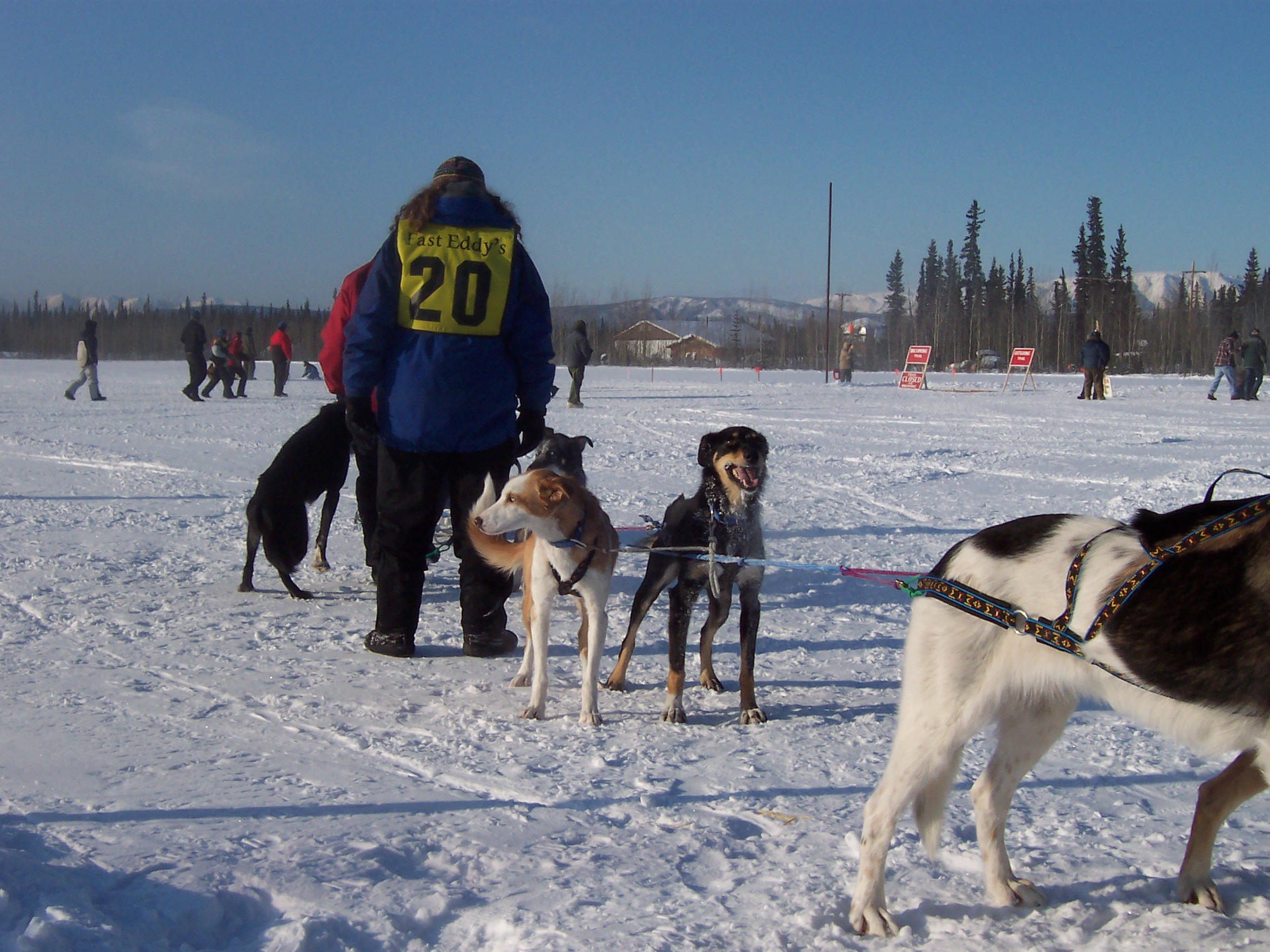
Yesterday we lost Koidern to complications from laryngeal paralysis. Koidern came to us in 2006 from Andrea’s mushing partner who thought she was too “ornery.” It is true that she wouldn’t hesitate to growl at a dog or cat who got too close to her food bowl, and she was protective of her favorite bed, but in every other way she was a very sweet dog. When she was younger she loved to give hugs, jumping up on her hind legs and wrapping her front legs around your waist. She was part Saluki, which made her very distinctive in Andrea’s dog teams and she never lost her beautiful brown coat, perky ears, and curled tail. I will miss her continual energy in the dog yard racing around after the other dogs, how she’d pounce on dog bones and toss them around, “smash” the cats, and the way she’d bark right before coming into the house as if to announce her entrance.
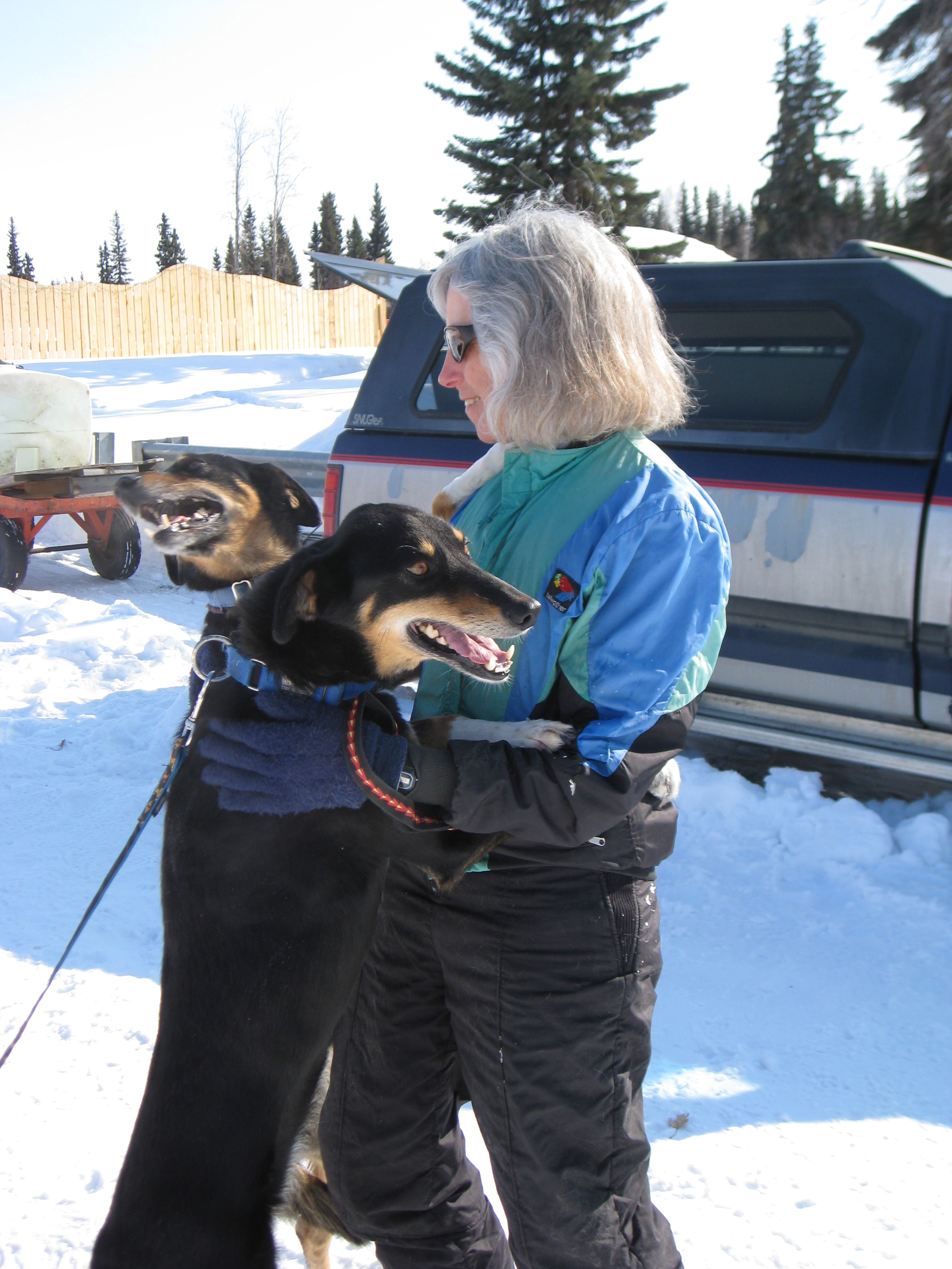
Koidern hug (with her sister Kluane and Carol Kaynor)
Koidern in Tok, with Piper and Buddy
Introduction
The Alaska Department of Transportation is working on updating their bicycling and pedestrian master plan for the state and their web site mentions Alaska as having high percentages of bicycle and pedestrian commuters relative to the rest of the country. I’m interested because I commute to work by bicycle (and occasionally ski or run) every day, either on the trails in the winter, or the roads in the summer. The company I work for (ABR) pays it’s employees $3.50 per day for using non-motorized means of transportation to get to work. I earned more than $700 last year as part of this program and ABR has paid it’s employees almost $40K since 2009 not to drive to work.
The Census Bureau keeps track of how people get to work in the American Community Survey, easily accessible from their web site. We’ll use this data to see if Alaska really does have higher than average rates of non-motorized commuters.
Data
The data comes from FactFinder. I chose ‘American Community Survey’ from the list of data sources near the bottom, searched for ‘bicycle’, chose ‘Commuting characteristics by sex’ (Table S0801), and added the ‘All States within United States and Puerto Rico’ as the Geography of interest. The site generates a zip file containing the data as a CSV file along with several other informational files. The code for extracting the data appears at the bottom of this post.
The data are percentages of workers 16 years and over and their means of transportation to work. Here’s a table showing the top 10 states ordered by the combination of bicycling and walking percentage.
| state | total | motorized | carpool | public_trans | walk | bicycle | |
|---|---|---|---|---|---|---|---|
| 1 | District of Columbia | 358,150 | 38.8 | 5.2 | 35.8 | 14.0 | 4.1 |
| 2 | Alaska | 363,075 | 80.5 | 12.6 | 1.5 | 7.9 | 1.1 |
| 3 | Montana | 484,043 | 84.9 | 10.4 | 0.8 | 5.6 | 1.6 |
| 4 | New York | 9,276,438 | 59.3 | 6.6 | 28.6 | 6.3 | 0.7 |
| 5 | Vermont | 320,350 | 85.1 | 8.2 | 1.3 | 5.8 | 0.8 |
| 6 | Oregon | 1,839,706 | 81.4 | 10.2 | 4.8 | 3.8 | 2.5 |
| 7 | Massachusetts | 3,450,540 | 77.6 | 7.4 | 10.6 | 5.0 | 0.8 |
| 8 | Wyoming | 289,163 | 87.3 | 10.0 | 2.2 | 4.6 | 0.6 |
| 9 | Hawaii | 704,914 | 80.9 | 13.5 | 7.0 | 4.1 | 0.9 |
| 10 | Washington | 3,370,945 | 82.2 | 9.8 | 6.2 | 3.7 | 1.0 |
Alaska has the second highest rates of walking and biking to work behind the District of Columbia. The table is an interesting combination of states with large urban centers (DC, New York, Oregon, Massachusetts) and those that are more rural (Alaska, Montana, Vermont, Wyoming).
Another way to rank the data is by combining all forms of transportation besides single-vehicle motorized transport (car pooling, public transportation, walking and bicycling).
| state | total | motorized | carpool | public_trans | walk | bicycle | |
|---|---|---|---|---|---|---|---|
| 1 | District of Columbia | 358,150 | 38.8 | 5.2 | 35.8 | 14.0 | 4.1 |
| 2 | New York | 9,276,438 | 59.3 | 6.6 | 28.6 | 6.3 | 0.7 |
| 3 | Massachusetts | 3,450,540 | 77.6 | 7.4 | 10.6 | 5.0 | 0.8 |
| 4 | New Jersey | 4,285,182 | 79.3 | 7.5 | 11.6 | 3.3 | 0.3 |
| 5 | Alaska | 363,075 | 80.5 | 12.6 | 1.5 | 7.9 | 1.1 |
| 6 | Hawaii | 704,914 | 80.9 | 13.5 | 7.0 | 4.1 | 0.9 |
| 7 | Oregon | 1,839,706 | 81.4 | 10.2 | 4.8 | 3.8 | 2.5 |
| 8 | Illinois | 6,094,828 | 81.5 | 7.9 | 9.3 | 3.0 | 0.7 |
| 9 | Washington | 3,370,945 | 82.2 | 9.8 | 6.2 | 3.7 | 1.0 |
| 10 | Maryland | 3,001,281 | 82.6 | 8.9 | 9.0 | 2.6 | 0.3 |
Here, the states with large urban centers come out higher because of the number of commuters using public transportation. Despite very low availability of public transportation, Alaska still winds up 5th on this list because of high rates of car pooling, in addition to walking and bicycling.
Map data
To look at regional patterns, we can make a map of the United States colored by non-motorized transportation percentage. This can be a little challenging because Alaska and Hawaii are so far from the rest of the country. What I’m doing here is loading the state data, transforming the data to a projection that’s appropriate for Alaska, and moving Alaska and Hawaii closer to the lower-48 for display. Again, the code appears at the bottom.
You can see that non-motorized transportation is very low throughout the deep south, and tends to be higher in the western half of the country, but the really high rates of bicycling and walking to work are isolated. High Vermont next to low New Hampshire, or Oregon and Montana split by Idaho.
Urban and rural, median age of the population
What explains the high rates of non-motorized commuting in Alaska and the other states at the top of the list? Urbanization is certainly one important factor explaining why the District of Columbia and states like New York, Oregon and Massachusetts have high rates of walking and bicycling. But what about Montana, Vermont, and Wyoming?
Age of the population might have an effect as well, as younger people are more likely to walk and bike to work than older people. Alaska has the second youngest population (33.3 years) in the U.S. and DC is third (33.8), but the other states in the top five (Utah, Texas, North Dakota) don’t have high non-motorized transportation.
So it’s more complicated that just these factors. California is a good example, with a combination of high urbanization (second, 95.0% urban), low median age (eighth, 36.2) and great weather year round, but is 19th for non-motorized commuting. Who walks in California, after all?
Conclusion
I hope DOT comes up with a progressive plan for improving opportunities for pedestrian and bicycle transportation in Alaska They’ve made some progress here in Fairbanks; building new paths for non-motorized traffic; but they also seem blind to the realities of actually using the roads and paths on a bicycle. The “bike path” near my house abruptly turns from asphalt to gravel a third of the way down Miller Hill, and the shoulders of the roads I commute on are filled with deep snow in winter, gravel in spring, and all manner of detritus year round. Many roads don’t have a useable shoulder at all.
Code
library(tidyverse)  # data import, manipulation
library(knitr)      # pretty tables
library(rpostgis)   # PostGIS support
library(rgdal)      # geographic transformation
library(maptools)   # geographic transformation
library(viridis)    # color blind color palette

# Read the heading
heading <- read_csv('ACS_15_1YR_S0801.csv', n_max = 1) %>% names()

# Read the data
s0801 <- read_csv('ACS_15_1YR_S0801.csv', col_names = FALSE, skip = 2)

names(s0801) <- heading

# Extract only the columns we need, add state postal codes
commute <- s0801 %>%
    transmute(state = `GEO.display-label`,
              total = HC01_EST_VC01,
              motorized = HC01_EST_VC03,
              carpool = HC01_EST_VC05,
              public_trans = HC01_EST_VC10,
              walk = HC01_EST_VC11,
              bicycle = HC01_EST_VC12) %>%
    filter(state != 'Puerto Rico') %>%
    mutate(state_postal = c('AL', 'AK', 'AZ', 'AR', 'CA', 'CO', 'CT',
                            'DE', 'DC', 'FL', 'GA', 'HI', 'ID', 'IL',
                            'IN', 'IA', 'KS', 'KY', 'LA', 'ME', 'MD',
                            'MA', 'MI', 'MN', 'MS', 'MO', 'MT', 'NE',
                            'NV', 'NH', 'NJ', 'NM', 'NY', 'NC', 'ND',
                            'OH', 'OK', 'OR', 'PA', 'RI', 'SC', 'SD',
                            'TN', 'TX', 'UT', 'VT', 'VA', 'WA', 'WV',
                            'WI', 'WY'))

# Print top ten tables
kable(commute %>% select(-state_postal) %>%
      arrange(desc(walk + bicycle)) %>% head(n = 10),
  format.args = list(big.mark = ","),
  row.names = TRUE)

kable(commute %>% select(-state_postal) %>%
      arrange(motorized) %>% head(n = 10),
  format.args = list(big.mark = ","),
  row.names = TRUE)

# Connect to the database with the state layer
layers <- src_postgres(host = "localhost",
                             dbname = "layers")

states <- pgGetGeom(layers$con, c("public", "states"),
                    geom = "wkb_geometry", gid = "ogc_fid")

# Transform to srid 3338 (Alaska Albers)
states_3338 <- spTransform(states, CRS("+proj=aea +lat_1=55 +lat_2=65 +lat_0=50
                                       +lon_0=-154 +x_0=0 +y_ 0=0 +ellps=GRS80
                                       +towgs84=0,0,0,0,0,0,0 +units=m
                                       +no_defs"))

# Convert to a data frame suitable for ggplot, move AK and HI
ggstates <- fortify(states_3338, region = "state") %>%
    filter(id != 'PR') %>%
    inner_join(commute, by = (c("id" = "state_postal"))) %>%
    mutate(lat = ifelse(state == 'Hawaii', lat + 2300000, lat),
           long = ifelse(state == 'Hawaii', long + 2000000, long),
           lat = ifelse(state == 'Alaska', lat + 1000000, lat),
           long = ifelse(state == 'Alaska', long + 2000000, long))

# Plot it
p <- ggplot() + geom_polygon(data = ggstates, colour = "black",
                        aes(x = long, y = lat, group = group,
                            fill = bicycle + walk)) +
    coord_fixed(ratio = 1) +
    scale_fill_viridis(name = "Non-motorized\n commuters (%)",
                       option = "plasma",
                       limits = c(0, 9), breaks = seq(0, 9, 3)) +
    theme_void() +
    theme(legend.position = c(0.9, 0.2))

width <- 16
height <- 9
resize <- 0.75

svg("non_motorized_commute_map.svg", width = width*resize, height = height*resize)
print(p)
dev.off()
pdf("non_motorized_commute_map.pdf", width = width*resize, height = height*resize)
print(p)
dev.off()

# Urban and rural percentages by state
heading <- read_csv('../urban_rural/DEC_10_SF1_P2.csv', n_max = 1) %>% names()

dec10 <- read_csv('../urban_rural/DEC_10_SF1_P2.csv', col_names = FALSE, skip = 2)

names(dec10) <- heading

urban_rural <- dec10 %>%
    transmute(state = `GEO.display-label`,
              total = D001,
              urban = D002,
              rural = D005) %>%
    filter(state != 'Puerto Rico') %>%
    mutate(urban_percentage = urban / total * 100)

# Median age by state
heading <- read_csv('../age_sex/ACS_15_1YR_S0101.csv', n_max = 1) %>% names()

s0101 <- read_csv('../age_sex/ACS_15_1YR_S0101.csv', col_names = FALSE, skip = 2)

names(s0101) <- heading

age <- s0101 %>%
    transmute(state = `GEO.display-label`,
              median_age = HC01_EST_VC35) %>%
    filter(state != 'Puerto Rico')

# Do urban percentage and median age explain anything about
# non-motorized transit?
census_data <- commute %>%
    inner_join(urban_rural, by = "state") %>%
    inner_join(age, by = "state") %>%
    select(state, state_postal, walk, bicycle, urban_percentage, median_age) %>%
    mutate(non_motorized = walk + bicycle)

u <- ggplot(data = census_data,
       aes(x = urban_percentage, y = non_motorized)) +
    geom_text(aes(label = state_postal))

svg("urban.svg", width = width*resize, height = height*resize)
print(u)
dev.off()

a <- ggplot(data = census_data,
       aes(x = median_age, y = non_motorized)) +
    geom_text(aes(label = state_postal))

svg("age.svg", width = width*resize, height = height*resize)
print(a)
dev.off()

# Not significant:
model = lm(data = census_data,
           non_motorized ~ urban_percentage + median_age)

# Only significant because of DC (a clear outlier)
model = lm(data = census_data,
           non_motorized ~ urban_percentage * median_age)
Introduction
The latest forecast discussions for Northern Alaska have included warnings that we are likely to experience an extended period of below normal temperatures starting at the end of this week, and yesterday’s Deep Cold blog post discusses the similarity of model forecast patterns to patterns seen in the 1989 and 1999 extreme cold events.
Our dogs spend most of their time in the house when we’re home, but if both of us are at work they’re outside in the dog yard. They have insulated dog houses, but when it’s colder than −15° F, we put them into a heated dog barn. That means one of us has to come home in the middle of the day to let them out to go to the bathroom.
Since we’re past the Winter Solstice, and day length is now increasing, I was curious to see if that has an effect on daily temperature, hopeful that the frequency of days when we need to put the dogs in the barn is decreasing.
Methods
We’ll use daily minimum and maximum temperature data from the Fairbanks International Airport station, keeping track of how many years the temperatures are below −15° F and dividing by the total to get a frequency. We live in a cold valley on Goldstream Creek, so our temperatures are typically several degrees colder than the Fairbanks Airport, and we often don’t warm up as much during the day as in other places, but minimum airport temperature is a reasonable proxy for the overall winter temperature at our house.
Results
The following plot shows the frequency of minimum (the top of each line) and maximum (the bottom) temperature colder than −15° F at the airport over the period of record, 1904−2016. The curved blue line represents a best fit line through the minimum temperature frequency, and the vertical blue line is drawn at the date when the frequency is the highest.

The maximum frequency is January 12th, so we have a few more days before the likelihood of needing to put the dogs in the barn starts to decline. The plot also shows that we could still reach that threshold all the way into April.
For fun, here’s the same plot using −40° as the threshold:

The date when the frequency starts to decline is shifted slightly to January 15th, and you can see the frequencies are lower. In mid-January, we can expect minimum temperature to be colder than −15° F more than half the time, but temperatures colder than −40° are just under 15%. There’s also an interesting anomaly in mid to late December where the frequency of very cold temperatures appears to drop.
Appendix: R code
library(tidyverse)
library(lubridate)
library(scales)

noaa <- src_postgres(host="localhost", dbname="noaa")

fairbanks <- tbl(noaa, build_sql("SELECT * FROM ghcnd_pivot
                                  WHERE station_name='FAIRBANKS INTL AP'")) %>%
    collect()

save(fairbanks, file="fairbanks_ghcnd.rdat")

for_plot <- fairbanks %>%
    mutate(doy=yday(dte),
           dte_str=format(dte, "%d %b"),
           min_below=ifelse(tmin_c < -26.11,1,0),
           max_below=ifelse(tmax_c < -26.11,1,0)) %>%
    filter(dte_str!="29 Feb") %>%
    mutate(doy=ifelse(leap_year(dte) & doy>60, doy-1, doy),
           doy=(doy+31+28+31+30)%%365) %>%
    group_by(doy, dte_str) %>%
    mutate(n_min=sum(ifelse(!is.na(min_below), 1, 0)),
           n_max=sum(ifelse(!is.na(max_below), 1, 0))) %>%
    summarize(min_freq=sum(min_below, na.rm=TRUE)/max(n_min, na.rm=TRUE),
              max_freq=sum(max_below, na.rm=TRUE)/max(n_max, na.rm=TRUE))

x_breaks <- for_plot %>%
    filter(doy %in% seq(49, 224, 7))

stats <- tibble(doy=seq(49, 224),
                pred=predict(loess(min_freq ~ doy,
                                   for_plot %>%
                                       filter(doy >= 49, doy <= 224))))

max_stats <- stats %>%
    arrange(desc(pred)) %>% head(n=1)

p <- ggplot(data=for_plot,
            aes(x=doy, ymin=min_freq, ymax=max_freq)) +
    geom_linerange() +
    geom_smooth(aes(y=min_freq), se=FALSE, size=0.5) +
    geom_segment(aes(x=max_stats$doy, xend=max_stats$doy,
                     y=-Inf, yend=max_stats$pred),
                 colour="blue", size=0.5) +
    scale_x_continuous(name=NULL,
                       limits=c(49, 224),
                       breaks=x_breaks$doy,
                       labels=x_breaks$dte_str) +
    scale_y_continuous(name="Frequency of days colder than −15° F",
                       breaks=pretty_breaks(n=10)) +
    theme_bw() +
    theme(axis.text.x=element_text(angle=30, hjust=1))

# Minus 40
for_plot <- fairbanks %>%
    mutate(doy=yday(dte),
           dte_str=format(dte, "%d %b"),
           min_below=ifelse(tmin_c < -40,1,0),
           max_below=ifelse(tmax_c < -40,1,0)) %>%
    filter(dte_str!="29 Feb") %>%
    mutate(doy=ifelse(leap_year(dte) & doy>60, doy-1, doy),
           doy=(doy+31+28+31+30)%%365) %>%
    group_by(doy, dte_str) %>%
    mutate(n_min=sum(ifelse(!is.na(min_below), 1, 0)),
           n_max=sum(ifelse(!is.na(max_below), 1, 0))) %>%
    summarize(min_freq=sum(min_below, na.rm=TRUE)/max(n_min, na.rm=TRUE),
              max_freq=sum(max_below, na.rm=TRUE)/max(n_max, na.rm=TRUE))

x_breaks <- for_plot %>%
    filter(doy %in% seq(63, 203, 7))

stats <- tibble(doy=seq(63, 203),
                pred=predict(loess(min_freq ~ doy,
                                   for_plot %>%
                                       filter(doy >= 63, doy <= 203))))

max_stats <- stats %>%
    arrange(desc(pred)) %>% head(n=1)

q <- ggplot(data=for_plot,
            aes(x=doy, ymin=min_freq, ymax=max_freq)) +
    geom_linerange() +
    geom_smooth(aes(y=min_freq), se=FALSE, size=0.5) +
    geom_segment(aes(x=max_stats$doy, xend=max_stats$doy,
                     y=-Inf, yend=max_stats$pred),
                 colour="blue", size=0.5) +
    scale_x_continuous(name=NULL,
                       limits=c(63, 203),
                       breaks=x_breaks$doy,
                       labels=x_breaks$dte_str) +
    scale_y_continuous(name="Frequency of days colder than −40°",
                       breaks=pretty_breaks(n=10)) +
    theme_bw() +
    theme(axis.text.x=element_text(angle=30, hjust=1))