Introduction
While riding to work this morning I figured out a way to disentangle the effects of trail quality and physical conditioning (both of which improve over the season) from temperature, which also tends to increase throughout the season. As you recall in my previous post, I found that days into the season (winter day of year) and minimum temperature were both negatively related with fat bike energy consumption. But because those variables are also related to each other, we can’t make statements about them individually.
But what if we look at pairs of trips that are within two days of each other and look at the difference in temperature between those trips and the difference in energy consumption? We’ll only pair trips going the same direction (to or from work), and we’ll restrict the pairings to two days or less. That eliminates seasonality from the data because we’re always comparing two trips from the same few days.
Data
For this analysis, I’m using SQL to filter the data because I’m better at window functions and filtering in SQL than R. Here’s the code to grab the data from the database. (The CSV file and RMarkdown script is on my GitHub repo for this analysis). The trick here is to categorize trips as being to work (“north”) or from work (“south”) and then include this field in the partition statement of the window function so I’m only getting the next trip that matches direction.
library(dplyr)
library(ggplot2)
library(scales)

exercise_db <- src_postgres(host="example.com", dbname="exercise_data")

diffs <- tbl(exercise_db,
            build_sql(
   "WITH all_to_work AS (
      SELECT *,
            CASE WHEN extract(hour from start_time) < 11
                 THEN 'north' ELSE 'south' END AS direction
      FROM track_stats
      WHERE type = 'Fat Biking'
            AND miles between 4 and 4.3
   ), with_next AS (
      SELECT track_id, start_time, direction, kcal, miles, min_temp,
            lead(direction) OVER w AS next_direction,
            lead(start_time) OVER w AS next_start_time,
            lead(kcal) OVER w AS next_kcal,
            lead(miles) OVER w AS next_miles,
            lead(min_temp) OVER w AS next_min_temp
      FROM all_to_work
      WINDOW w AS (PARTITION BY direction ORDER BY start_time)
   )
   SELECT start_time, next_start_time, direction,
      min_temp, next_min_temp,
      kcal / miles AS kcal_per_mile,
      next_kcal / next_miles as next_kcal_per_mile,
      next_min_temp - min_temp AS temp_diff,
      (next_kcal / next_miles) - (kcal / miles) AS kcal_per_mile_diff
   FROM with_next
   WHERE next_start_time - start_time < '60 hours'
   ORDER BY start_time")) %>% collect()

write.csv(diffs, file="fat_biking_trip_diffs.csv", quote=TRUE,
         row.names=FALSE)
kable(head(diffs))
| start time | next start time | temp diff | kcal / mile diff |
|---|---|---|---|
| 2013-12-03 06:21:49 | 2013-12-05 06:31:54 | 3.0 | -13.843866 |
| 2013-12-03 15:41:48 | 2013-12-05 15:24:10 | 3.7 | -8.823329 |
| 2013-12-05 06:31:54 | 2013-12-06 06:39:04 | 23.4 | -22.510564 |
| 2013-12-05 15:24:10 | 2013-12-06 16:38:31 | 13.6 | -5.505662 |
| 2013-12-09 06:41:07 | 2013-12-11 06:15:32 | -27.7 | -10.227048 |
| 2013-12-09 13:44:59 | 2013-12-11 16:00:11 | -25.4 | -1.034789 |
Out of a total of 123 trips, 70 took place within 2 days of each other. We still don’t have a measure of trail quality, so pairs where the trail is smooth and hard one day and covered with fresh snow the next won’t be particularly good data points.
Let’s look at a plot of the data.
s = ggplot(data=diffs,
         aes(x=temp_diff, y=kcal_per_mile_diff)) +
   geom_point() +
   geom_smooth(method="lm", se=FALSE) +
   scale_x_continuous(name="Temperature difference between paired trips (degrees F)",
                     breaks=pretty_breaks(n=10)) +
   scale_y_continuous(name="Energy consumption difference (kcal / mile)",
                     breaks=pretty_breaks(n=10)) +
   theme_bw() +
   ggtitle("Paired fat bike trips to and from work within 2 days of each other")

print(s)
This shows that when the temperature difference between two paired trips is negative (the second trip is colder than the first), additional energy is required for the second (colder) trip. This matches the pattern we saw in my earlier post where minimum temperature and winter day of year were negatively associated with energy consumption. But because we’ve used differences to remove seasonal effects, we can actually determine how large of an effect temperature has.
There are quite a few outliers here. Those that are in the region with very little difference in temperature are likey due to snowfall changing the trail conditions from one trip to the next. I’m not sure why there is so much scatter among the points on the left side of the graph, but I don’t see any particular pattern among those points that might explain the higher than normal variation, and we don’t see the same variation in the points with a large positive difference in temperature, so I think this is just normal variation in the data not explained by temperature.
Results
Here’s the linear regression results for this data.
summary(lm(data=diffs, kcal_per_mile_diff ~ temp_diff))
##
## Call:
## lm(formula = kcal_per_mile_diff ~ temp_diff, data = diffs)
##
## Residuals:
##     Min      1Q  Median      3Q     Max
## -40.839  -4.584  -0.169   3.740  47.063
##
## Coefficients:
##             Estimate Std. Error t value Pr(>|t|)
## (Intercept)  -2.1696     1.5253  -1.422    0.159
## temp_diff    -0.7778     0.1434  -5.424 8.37e-07 ***
## ---
## Signif. codes:  0 '***' 0.001 '**' 0.01 '*' 0.05 '.' 0.1 ' ' 1
##
## Residual standard error: 12.76 on 68 degrees of freedom
## Multiple R-squared:  0.302,  Adjusted R-squared:  0.2917
## F-statistic: 29.42 on 1 and 68 DF,  p-value: 8.367e-07
The model and coefficient are both highly signficant, and as we might expect, the intercept in the model is not significantly different from zero (if there wasn’t a difference in temperature between two trips there shouldn’t be a difference in energy consumption either, on average). Temperature alone explains 30% of the variation in energy consumption, and the coefficient tells us the scale of the effect: each degree drop in temperature results in an increase in energy consumption of 0.78 kcalories per mile. So for a 4 mile commute like mine, the difference between a trip at 10°F vs −20°F is an additional 93 kilocalories (30 × 0.7778 × 4 = 93.34) on the colder trip. That might not sound like much in the context of the calories in food (93 kilocalories is about the energy in a large orange or a light beer), but my average energy consumption across all fat bike trips to and from work is 377 kilocalories so 93 represents a large portion of the total.
Introduction
I’ve had a fat bike since late November 2013, mostly using it to commute the 4.1 miles to and from work on the Goldstream Valley trail system. I used to classic ski exclusively, but that’s not particularly pleasant once the temperatures are below 0°F because I can’t keep my hands and feet warm enough, and the amount of glide you get on skis declines as the temperature goes down.
However, it’s also true that fat biking gets much harder the colder it gets. I think this is partly due to biking while wearing lots of extra layers, but also because of increased friction between the large tires and tubes in a fat bike. In this post I will look at how temperature and other variables affect the performance of a fat bike (and it’s rider).
The code and data for this post is available on GitHub.
Data
I log all my commutes (and other exercise) using the RunKeeper app, which uses the phone’s GPS to keep track of distance and speed, and connects to my heart rate monitor to track heart rate. I had been using a Polar HR chest strap, but after about a year it became flaky and I replaced it with a Scosche Rhythm+ arm band monitor. The data from RunKeeper is exported into GPX files, which I process and insert into a PostgreSQL database.
From the heart rate data, I estimate energy consumption (in kilocalories, or what appears on food labels as calories) using a formula from Keytel LR, et al. 2005, which I talk about in this blog post.
Let’s take a look at the data:
library(dplyr)
library(ggplot2)
library(scales)
library(lubridate)
library(munsell)

fat_bike <- read.csv("fat_bike.csv", stringsAsFactors=FALSE, header=TRUE) %>%
    tbl_df() %>%
    mutate(start_time=ymd_hms(start_time, tz="US/Alaska"))

kable(head(fat_bike))
| start_time | miles | time | hours | mph | hr | kcal | min_temp | max_temp |
|---|---|---|---|---|---|---|---|---|
| 2013-11-27 06:22:13 | 4.17 | 0:35:11 | 0.59 | 7.12 | 157.8 | 518.4 | -1.1 | 1.0 |
| 2013-11-27 15:27:01 | 4.11 | 0:35:49 | 0.60 | 6.89 | 156.0 | 513.6 | 1.1 | 2.2 |
| 2013-12-01 12:29:27 | 4.79 | 0:55:08 | 0.92 | 5.21 | 172.6 | 951.5 | -25.9 | -23.9 |
| 2013-12-03 06:21:49 | 4.19 | 0:39:16 | 0.65 | 6.40 | 148.4 | 526.8 | -4.6 | -2.1 |
| 2013-12-03 15:41:48 | 4.22 | 0:30:56 | 0.52 | 8.19 | 154.6 | 434.5 | 6.0 | 7.9 |
| 2013-12-05 06:31:54 | 4.14 | 0:32:14 | 0.54 | 7.71 | 155.8 | 463.2 | -1.6 | 2.9 |
There are a few things we need to do to the raw data before analyzing it. First, we want to restrict the data to just my commutes to and from work, and we want to categorize them as being one or the other. That way we can analyze trips to ABR and home separately, and we’ll reduce the variation within each analysis. If we were to analyze all fat biking trips together, we’d be lumping short and long trips, as well as those with a different proportion of hills or more challenging conditions. To get just trips to and from work, I’m restricting the distance to trips between 4.0 and 4.3 miles, and only those activities where there were two of them in a single day (to work and home from work). To categorize them into commutes to work and home, I filter based on the time of day.
I’m also calculating energy per mile, and adding a “winter day of year” variable (wdoy), which is a measure of how far into the winter season the trip took place. We can’t just use day of year because that starts over on January 1st, so we subtract the number of days between January and May from the date and get day of year from that. Finally, we split the data into trips to work and home.
I’m also excluding the really early season data from 2015 because the trail was in really poor condition.
fat_bike_commute <- fat_bike %>%
    filter(miles>4, miles<4.3) %>%
    mutate(direction=ifelse(hour(start_time)<10, 'north', 'south'),
           date=as.Date(start_time, tz='US/Alaska'),
           wdoy=yday(date-days(120)),
           kcal_per_mile=kcal/miles) %>%
    group_by(date) %>%
    mutate(n=n()) %>%
    ungroup() %>%
    filter(n>1)

to_abr <- fat_bike_commute %>% filter(direction=='north',
                                      wdoy>210)
to_home <- fat_bike_commute %>% filter(direction=='south',
                                       wdoy>210)
kable(head(to_home %>% select(-date, -kcal, -n)))
| start_time | miles | time | hours | mph | hr | min_temp | max_temp | direction | wdoy | kcal_per_mile |
|---|---|---|---|---|---|---|---|---|---|---|
| 2013-11-27 15:27:01 | 4.11 | 0:35:49 | 0.60 | 6.89 | 156.0 | 1.1 | 2.2 | south | 211 | 124.96350 |
| 2013-12-03 15:41:48 | 4.22 | 0:30:56 | 0.52 | 8.19 | 154.6 | 6.0 | 7.9 | south | 217 | 102.96209 |
| 2013-12-05 15:24:10 | 4.18 | 0:29:07 | 0.49 | 8.60 | 150.7 | 9.7 | 12.0 | south | 219 | 94.13876 |
| 2013-12-06 16:38:31 | 4.17 | 0:26:04 | 0.43 | 9.60 | 154.3 | 23.3 | 24.7 | south | 220 | 88.63309 |
| 2013-12-09 13:44:59 | 4.11 | 0:32:06 | 0.54 | 7.69 | 161.3 | 27.5 | 28.5 | south | 223 | 119.19708 |
| 2013-12-11 16:00:11 | 4.19 | 0:33:48 | 0.56 | 7.44 | 157.6 | 2.1 | 4.5 | south | 225 | 118.16229 |
Analysis
Here a plot of the data. We’re plotting all trips with winter day of year on the x-axis and energy per mile on the y-axis. The color of the points indicates the minimum temperature and the straight line shows the trend of the relationship.
s <- ggplot(data=fat_bike_commute %>% filter(wdoy>210), aes(x=wdoy, y=kcal_per_mile, colour=min_temp)) +
    geom_smooth(method="lm", se=FALSE, colour=mnsl("10B 7/10", fix=TRUE)) +
    geom_point(size=3) +
    scale_x_continuous(name=NULL,
                       breaks=c(215, 246, 277, 305, 336),
                       labels=c('1-Dec', '1-Jan', '1-Feb', '1-Mar', '1-Apr')) +
    scale_y_continuous(name="Energy (kcal)", breaks=pretty_breaks(n=10)) +
    scale_colour_continuous(low=mnsl("7.5B 5/12", fix=TRUE), high=mnsl("7.5R 5/12", fix=TRUE),
                            breaks=pretty_breaks(n=5),
                            guide=guide_colourbar(title="Min temp (°F)", reverse=FALSE, barheight=8)) +
    ggtitle("All fat bike trips") +
    theme_bw()
print(s)
Across all trips, we can see that as the winter progresses, I consume less energy per mile. This is hopefully because my physical condition improves the more I ride, and also because the trail conditions also improve as the snow pack develops and the trail gets harder with use. You can also see a pattern in the color of the dots, with the bluer (and colder) points near the top and the warmer temperature trips near the bottom.
Let’s look at the temperature relationship:
s <- ggplot(data=fat_bike_commute %>% filter(wdoy>210), aes(x=min_temp, y=kcal_per_mile, colour=wdoy)) +
    geom_smooth(method="lm", se=FALSE, colour=mnsl("10B 7/10", fix=TRUE)) +
    geom_point(size=3) +
    scale_x_continuous(name="Minimum temperature (degrees F)", breaks=pretty_breaks(n=10)) +
    scale_y_continuous(name="Energy (kcal)", breaks=pretty_breaks(n=10)) +
    scale_colour_continuous(low=mnsl("7.5PB 2/12", fix=TRUE), high=mnsl("7.5PB 8/12", fix=TRUE),
                            breaks=c(215, 246, 277, 305, 336),
                            labels=c('1-Dec', '1-Jan', '1-Feb', '1-Mar', '1-Apr'),
                            guide=guide_colourbar(title=NULL, reverse=TRUE, barheight=8)) +
    ggtitle("All fat bike trips") +
    theme_bw()
print(s)
A similar pattern. As the temperature drops, it takes more energy to go the same distance. And the color of the points also shows the relationship from the earlier plot where trips taken later in the season require less energy.
There is also be a correlation between winter day of year and temperature. Since the winter fat biking season essentially begins in December, it tends to warm up throughout.
Results
The relationship between winter day of year and temperature means that we’ve got multicollinearity in any model that includes both of them. This doesn’t mean we shouldn’t include them, nor that the significance or predictive power of the model is reduced. All it means is that we can’t use the individual regression coefficients to make predictions.
Here are the linear models for trips to work, and home:
to_abr_lm <- lm(data=to_abr, kcal_per_mile ~ min_temp + wdoy)
print(summary(to_abr_lm))
##
## Call:
## lm(formula = kcal_per_mile ~ min_temp + wdoy, data = to_abr)
##
## Residuals:
##     Min      1Q  Median      3Q     Max
## -27.845  -6.964  -3.186   3.609  53.697
##
## Coefficients:
##              Estimate Std. Error t value Pr(>|t|)
## (Intercept) 170.81359   15.54834  10.986 1.07e-14 ***
## min_temp     -0.45694    0.18368  -2.488   0.0164 *
## wdoy         -0.29974    0.05913  -5.069 6.36e-06 ***
## ---
## Signif. codes:  0 '***' 0.001 '**' 0.01 '*' 0.05 '.' 0.1 ' ' 1
##
## Residual standard error: 15.9 on 48 degrees of freedom
## Multiple R-squared:  0.4069, Adjusted R-squared:  0.3822
## F-statistic: 16.46 on 2 and 48 DF,  p-value: 3.595e-06
to_home_lm <- lm(data=to_home, kcal_per_mile ~ min_temp + wdoy)
print(summary(to_home_lm))
##
## Call:
## lm(formula = kcal_per_mile ~ min_temp + wdoy, data = to_home)
##
## Residuals:
##     Min      1Q  Median      3Q     Max
## -21.615 -10.200  -1.068   3.741  39.005
##
## Coefficients:
##              Estimate Std. Error t value Pr(>|t|)
## (Intercept) 144.16615   18.55826   7.768 4.94e-10 ***
## min_temp     -0.47659    0.16466  -2.894  0.00570 **
## wdoy         -0.20581    0.07502  -2.743  0.00852 **
## ---
## Signif. codes:  0 '***' 0.001 '**' 0.01 '*' 0.05 '.' 0.1 ' ' 1
##
## Residual standard error: 13.49 on 48 degrees of freedom
## Multiple R-squared:  0.5637, Adjusted R-squared:  0.5455
## F-statistic: 31.01 on 2 and 48 DF,  p-value: 2.261e-09
The models confirm what we saw in the plots. Both regression coefficients are negative, which means that as the temperature rises (and as the winter goes on) I consume less energy per mile. The models themselves are significant as are the coefficients, although less so in the trips to work. The amount of variation in kcal/mile explained by minimum temperature and winter day of year is 41% for trips to work and 56% for trips home.
What accounts for the rest of the variation? My guess is that trail conditions are the missing factor here; specifically fresh snow, or a trail churned up by snowmachiners. I think that’s also why the results are better on trips home than to work. On days when we get snow overnight, I am almost certainly riding on an pristine snow-covered trail, but by the time I leave work, the trail will be smoother and harder due to all the traffic it’s seen over the course of the day.
Conclusions
We didn’t really find anything surprising here: it is significantly harder to ride a fat bike when it’s colder. Because of conditioning, improved trail conditions, as well as the tendency for warmer weather later in the season, it also gets easier to ride as the winter goes on.

1991 contacts
Yesterday I was going through my journal books from the early 90s to see if I could get a sense of how much bicycling I did when I lived in Davis California. I came across the list of my network contacts from January 1991 shown in the photo. I had an email, bitnet and uucp address on the UC Davis computer system. I don’t have any record of actually using these, but I do remember the old email clients that required lines be less than 80 characters, but which were unable to edit lines already entered.
I found the statistics for 109 of my bike rides between April 1991 and June 1992, and I think that probably represents most of them from that period. I moved to Davis in the fall of 1990 and left in August 1993, however, and am a little surprised I didn’t find any rides from those first six months or my last year in California.
I rode 2,671 miles in those fifteen months, topping out at 418 miles in June 1991. There were long gaps in the record where I didn’t ride at all, but when I rode, my average weekly mileage was 58 miles and maxed out at 186 miles.
To put that in perspective, in the last seven years of commuting to work and riding recreationally, my highest monthly mileage was 268 miles (last month!), my average weekly mileage was 38 miles, and the farthest I’ve gone in a week was 81 miles.
The road biking season is getting near to the end here in Fairbanks as the chances of significant snowfall on the roads rises dramatically, but I hope that next season I can push my legs (and hip) harder and approach some of the mileage totals I reached more than twenty years ago.
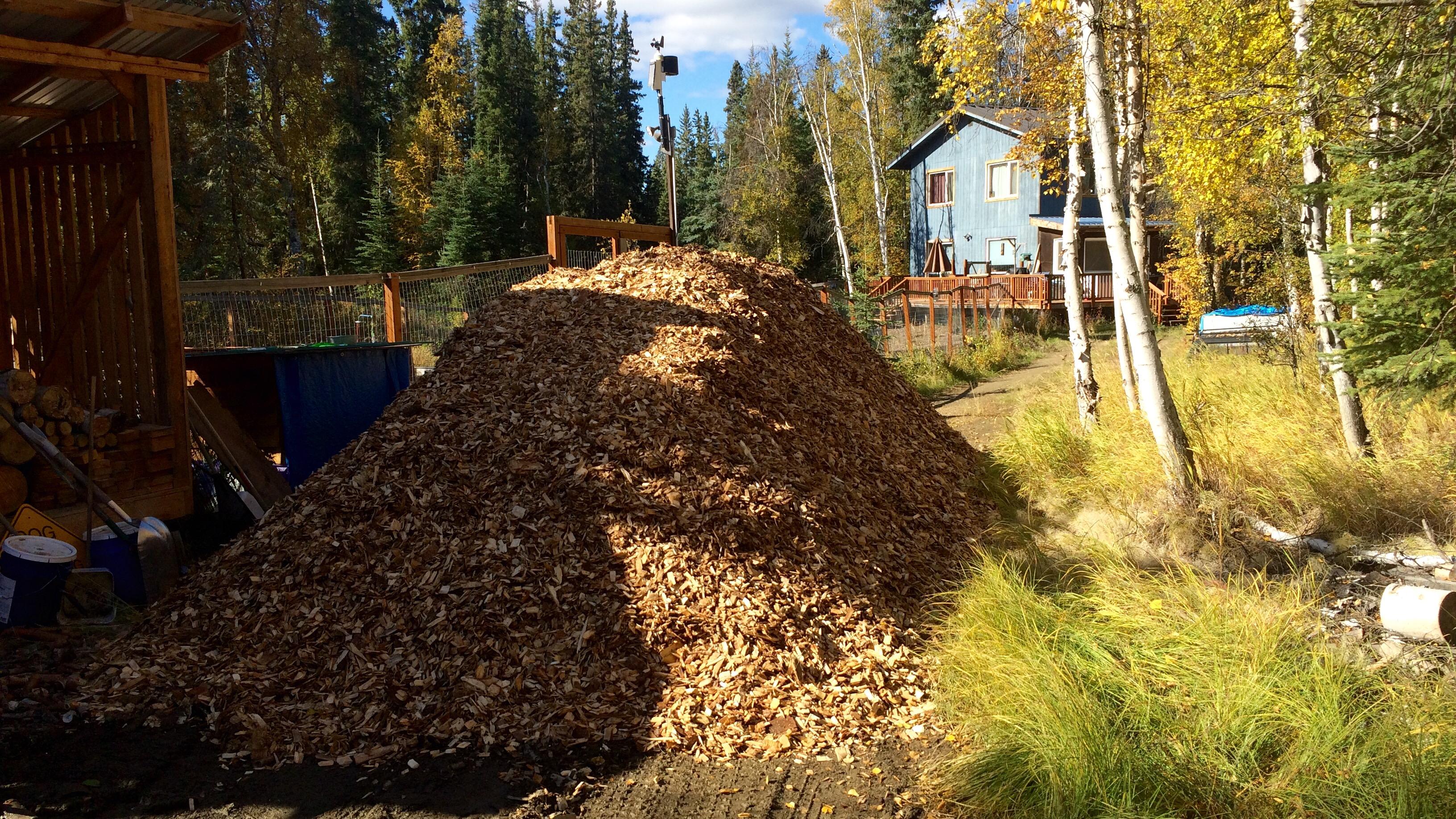
Thirty yards of wood chips
Every couple years we cover our dog yard with a fresh layer of wood chips from the local sawmill, Northland Wood. This year I decided to keep closer track of how much effort it takes to move all 30 yards of wood chips by counting each wheelbarrow load, recording how much time I spent, and by using a heart rate monitor to keep track of effort.
The image below show the tally board. Tick marks indicate wheelbarrow-loads, the numbers under each set of five were the number of minutes since the start of each bout of work, and the numbers on the right are total loads and total minutes. I didn’t keep track of time, or heart rate, for the first set of 36 loads.

It’s not on the chalkboard, but my heart rate averaged 96 beats per minute for the first effort on Saturday morning, and 104, 96, 103, and 103 bpm for the rest. That averages out to 100.9 beats per minute.
For the loads where I was keeping track of time, I averaged 3 minutes and 12 seconds per load. Using that average for the 36 loads on Friday afternoon, that means I spent around 795 minutes, or 13 hours and 15 minutes moving and spreading 248 wheelbarrow-loads of chips.
Using a formula found in [Keytel LR, et al. 2005. Prediction of energy expenditure from heart rate monitoring during submaximal exercise. J Sports Sci. 23(3):289-97], I calculate that I burned 4,903 calories above the amount I would have if I’d been sitting around all weekend. To put that in perspective, I burned 3,935 calories running the Equinox Marathon in September, 2013.
As I was loading the wheelbarrow, I was mentally keeping track of how many pitchfork-loads it took to fill the wheelbarrow, and the number hovered right around 17. That means there are about 4,216 pitchfork loads in 30 yards of wood chips.
To summarize: 30 yards of wood chips is equivalent to 248 wheelbarrow loads. Each wheelbarrow-load is 0.1209 yards, or 3.26 cubic feet. Thirty yards of wood chips is also equivalent to 4,216 pitchfork loads, each of which is 0.19 cubic feet. It took me 13.25 hours to move and spread it all, or 3.2 minutes per wheelbarrow-load, or 11 seconds per pitchfork-load.
One final note: this amount completely covered all but a few square feet of the dog yard. In some places the chips were at least six inches deep, and in others there’s just a light covering of new over old. I don’t have a good measure of the yard, but if I did, I’d be able to calculate the average depth of the chips. My guess is that it is around 2,500 square feet, which is what 30 yards would cover to an average depth of 4 inches.
Introduction
Often when I’m watching Major League Baseball games a player will come up to bat or pitch and I’ll comment “former Oakland Athletic” and the player’s name. It seems like there’s always one or two players on the roster of every team that used to be an Athletic.
Let’s find out. We’ll use the Retrosheet database again, this time using the roster lists from 1990 through 2014 and comparing it against the 40-man rosters of current teams. That data will have to be scraped off the web, since Retrosheet data doesn’t exist for the current season and rosters change frequently during the season.
Methods
As usual, I’ll use R for the analysis, and rmarkdown to produce this post.
library(plyr)
library(dplyr)
library(rvest)
options(stringsAsFactors=FALSE)
We’re using plyr and dplyr for most of the data manipulation and rvest to grab the 40-man rosters for each team from the MLB website. Setting stringsAsFactors to false prevents various base R packages from converting everything to factors. We're not doing any statistics with this data, so factors aren't necessary and make comparisons and joins between data frames more difficult.
Players by team for previous years
Load the roster data:
retrosheet_db <- src_postgres(host="localhost", port=5438,
                              dbname="retrosheet", user="cswingley")

rosters <- tbl(retrosheet_db, "rosters")

all_recent_players <-
     rosters %>%
     filter(year>1989) %>%
     collect() %>%
     mutate(player=paste(first_name, last_name),
            team=team_id) %>%
     select(player, team, year)

save(all_recent_players, file="all_recent_players.rdata", compress="gzip")
The Retrosheet database lives in PostgreSQL on my computer, but one of the advantages of using dplyr for retrieval is it would be easy to change the source statement to connect to another sort of database (SQLite, MySQL, etc.) and the rest of the commands would be the same.
We only grab data since 1990 and we combine the first and last names into a single field because that’s how player names are listed on the 40-man roster pages on the web.
Now we filter the list down to Oakland Athletic players, combine the rows for each Oakland player, summarizing the years they played for the A’s into a single column.
oakland_players <- all_recent_players %>%
    filter(team=='OAK') %>%
    group_by(player) %>%
    summarise(years=paste(year, collapse=', '))
Here’s what that looks like:
kable(head(oakland_players))
| player | years |
|---|---|
| A.J. Griffin | 2012, 2013 |
| A.J. Hinch | 1998, 1999, 2000 |
| Aaron Cunningham | 2008, 2009 |
| Aaron Harang | 2002, 2003 |
| Aaron Small | 1996, 1997, 1998 |
| Adam Dunn | 2014 |
| ... | ... |
Current 40-man rosters
Major League Baseball has the 40-man rosters for each team on their site. In order to extract them, we create a list of the team identifiers (oak, sf, etc.), then loop over this list, grabbing the team name and all the player names. We also set up lists for the team names (“Athletics”, “Giants”, etc.) so we can replace the short identifiers with real names later.
teams=c("ana", "ari", "atl", "bal", "bos", "cws", "chc", "cin", "cle", "col",
        "det", "mia", "hou", "kc", "la", "mil", "min", "nyy", "nym", "oak",
        "phi", "pit", "sd", "sea", "sf", "stl", "tb", "tex", "tor", "was")

team_names = c("Angels", "Diamondbacks", "Braves", "Orioles", "Red Sox",
               "White Sox", "Cubs", "Reds", "Indians", "Rockies", "Tigers",
               "Marlins", "Astros", "Royals", "Dodgers", "Brewers", "Twins",
               "Yankees", "Mets", "Athletics", "Phillies", "Pirates",
               "Padres", "Mariners", "Giants", "Cardinals", "Rays", "Rangers",
               "Blue Jays", "Nationals")

get_players <- function(team) {
    # reads the 40-man roster data for a team, returns a data frame

    roster_html <- html(paste("http://www.mlb.com/team/roster_40man.jsp?c_id=",
                              team,
                              sep=''))

    players <- roster_html %>%
        html_nodes("#roster_40_man a") %>%
        html_text()

    data.frame(team=team, player=players)
}

current_rosters <- ldply(teams, get_players)

save(current_rosters, file="current_rosters.rdata", compress="gzip")
Here’s what that data looks like:
kable(head(current_rosters))
| team | player |
|---|---|
| ana | Jose Alvarez |
| ana | Cam Bedrosian |
| ana | Andrew Heaney |
| ana | Jeremy McBryde |
| ana | Mike Morin |
| ana | Vinnie Pestano |
| ... | ... |
Combine the data
To find out how many players on each Major League team used to play for the A’s we combine the former A’s players with the current rosters using player name. This may not be perfect due to differences in spelling (accented characters being the most likely issue), but the results look pretty good.
roster_with_oakland_time <- current_rosters %>%
    left_join(oakland_players, by="player") %>%
    filter(!is.na(years))

kable(head(roster_with_oakland_time))
| team | player | years |
|---|---|---|
| ana | Huston Street | 2005, 2006, 2007, 2008 |
| ana | Grant Green | 2013 |
| ana | Collin Cowgill | 2012 |
| ari | Brad Ziegler | 2008, 2009, 2010, 2011 |
| ari | Cliff Pennington | 2008, 2009, 2010, 2011, 2012 |
| atl | Trevor Cahill | 2009, 2010, 2011 |
| ... | ... | ... |
You can see from this table (just the first six rows of the results) that the Angels have three players that were Athletics.
Let’s do the math and find out how many former A’s are on each team’s roster.
n_former_players_by_team <-
    roster_with_oakland_time %>%
        group_by(team) %>%
        arrange(player) %>%
        summarise(number_of_players=n(),
                  players=paste(player, collapse=", ")) %>%
        arrange(desc(number_of_players)) %>%
        inner_join(data.frame(team=teams, team_name=team_names),
                   by="team") %>%
        select(team_name, number_of_players, players)

names(n_former_players_by_team) <- c('Team', 'Number',
                                     'Former Oakland Athletics')
kable(n_former_players_by_team,
      align=c('l', 'r', 'r'))
| Team | Number | Former Oakland Athletics |
|---|---|---|
| Athletics | 22 | A.J. Griffin, Andy Parrino, Billy Burns, Coco Crisp, Craig Gentry, Dan Otero, Drew Pomeranz, Eric O'Flaherty, Eric Sogard, Evan Scribner, Fernando Abad, Fernando Rodriguez, Jarrod Parker, Jesse Chavez, Josh Reddick, Nate Freiman, Ryan Cook, Sam Fuld, Scott Kazmir, Sean Doolittle, Sonny Gray, Stephen Vogt |
| Astros | 5 | Chris Carter, Dan Straily, Jed Lowrie, Luke Gregerson, Pat Neshek |
| Braves | 4 | Jim Johnson, Jonny Gomes, Josh Outman, Trevor Cahill |
| Rangers | 4 | Adam Rosales, Colby Lewis, Kyle Blanks, Michael Choice |
| Angels | 3 | Collin Cowgill, Grant Green, Huston Street |
| Cubs | 3 | Chris Denorfia, Jason Hammel, Jon Lester |
| Dodgers | 3 | Alberto Callaspo, Brandon McCarthy, Brett Anderson |
| Mets | 3 | Anthony Recker, Bartolo Colon, Jerry Blevins |
| Yankees | 3 | Chris Young, Gregorio Petit, Stephen Drew |
| Rays | 3 | David DeJesus, Erasmo Ramirez, John Jaso |
| Diamondbacks | 2 | Brad Ziegler, Cliff Pennington |
| Indians | 2 | Brandon Moss, Nick Swisher |
| White Sox | 2 | Geovany Soto, Jeff Samardzija |
| Tigers | 2 | Rajai Davis, Yoenis Cespedes |
| Royals | 2 | Chris Young, Joe Blanton |
| Marlins | 2 | Dan Haren, Vin Mazzaro |
| Padres | 2 | Derek Norris, Tyson Ross |
| Giants | 2 | Santiago Casilla, Tim Hudson |
| Nationals | 2 | Gio Gonzalez, Michael Taylor |
| Red Sox | 1 | Craig Breslow |
| Rockies | 1 | Carlos Gonzalez |
| Brewers | 1 | Shane Peterson |
| Twins | 1 | Kurt Suzuki |
| Phillies | 1 | Aaron Harang |
| Mariners | 1 | Seth Smith |
| Cardinals | 1 | Matt Holliday |
| Blue Jays | 1 | Josh Donaldson |
Pretty cool. I do notice one problem: there are actually two Chris Young’s playing in baseball today. Chris Young the outfielder played for the A’s in 2013 and now plays for the Yankees. There’s also a pitcher named Chris Young who shows up on our list as a former A’s player who now plays for the Royals. This Chris Young never actually played for the A’s. The Retrosheet roster data includes which hand (left and/or right) a player bats and throws with, and it’s possible this could be used with the MLB 40-man roster data to eliminate incorrect joins like this, but even with that enhancement, we still have the problem that we’re joining on things that aren’t guaranteed to uniquely identify a player. That’s the nature of attempting to combine data from different sources.
One other interesting thing. I kept the A’s in the list because the number of former A’s currently playing for the A’s is a measure of how much turnover there is within an organization. Of the 40 players on the current A’s roster, only 22 of them have ever played for the A’s. That means that 18 came from other teams or are promotions from the minors that haven’t played for any Major League teams yet.
All teams
Teams with players on other teams
Now that we’ve looked at how many A’s players have played for other teams, let’s see how the number of players playing for other teams is related to team. My gut feeling is that the A’s will be at the top of this list as a small market, low budget team who is forced to turn players over regularly in order to try and stay competitive.
We already have the data for this, but need to manipulate it in a different way to get the result.
teams <- c("ANA", "ARI", "ATL", "BAL", "BOS", "CAL", "CHA", "CHN", "CIN",
           "CLE", "COL", "DET", "FLO", "HOU", "KCA", "LAN", "MIA", "MIL",
           "MIN", "MON", "NYA", "NYN", "OAK", "PHI", "PIT", "SDN", "SEA",
           "SFN", "SLN", "TBA", "TEX", "TOR", "WAS")

team_names <- c("Angels", "Diamondbacks", "Braves", "Orioles", "Red Sox",
                "Angels", "White Sox", "Cubs", "Reds", "Indians", "Rockies",
                "Tigers", "Marlins", "Astros", "Royals", "Dodgers", "Marlins",
                "Brewers", "Twins", "Expos", "Yankees", "Mets", "Athletics",
                "Phillies", "Pirates", "Padres", "Mariners", "Giants",
                "Cardinals", "Rays", "Rangers", "Blue Jays", "Nationals")

players_on_other_teams <- all_recent_players %>%
    group_by(player, team) %>%
    summarise(years=paste(year, collapse=", ")) %>%
    inner_join(current_rosters, by="player") %>%
    mutate(current_team=team.y, former_team=team.x) %>%
    select(player, current_team, former_team, years) %>%
    inner_join(data.frame(former_team=teams, former_team_name=team_names),
                by="former_team") %>%
    group_by(former_team_name, current_team) %>%
    summarise(n=n()) %>%
    group_by(former_team_name) %>%
    arrange(desc(n)) %>%
    mutate(rank=row_number()) %>%
    filter(rank!=1) %>%
    summarise(n=sum(n)) %>%
    arrange(desc(n))
This is a pretty complicated set of operations. The main trick (and possible flaw in the analysis) is to get a list similar to the one we got for the A’s earlier, and eliminate the first row (the number of players on a team who played for that same team in the past) before counting the total players who have played for other teams. It would probably be better to eliminate that case using team name, but the team codes vary between Retrosheet and the MLB roster data.
Here are the results:
names(players_on_other_teams) <- c('Former Team', 'Number of players')

kable(players_on_other_teams)
| Former Team | Number of players |
|---|---|
| Athletics | 57 |
| Padres | 57 |
| Marlins | 56 |
| Rangers | 55 |
| Diamondbacks | 51 |
| Braves | 50 |
| Yankees | 50 |
| Angels | 49 |
| Red Sox | 47 |
| Pirates | 46 |
| Royals | 44 |
| Dodgers | 43 |
| Mariners | 42 |
| Rockies | 42 |
| Cubs | 40 |
| Tigers | 40 |
| Astros | 38 |
| Blue Jays | 38 |
| Rays | 38 |
| White Sox | 38 |
| Indians | 35 |
| Mets | 35 |
| Twins | 33 |
| Cardinals | 31 |
| Nationals | 31 |
| Orioles | 31 |
| Reds | 28 |
| Brewers | 26 |
| Phillies | 25 |
| Giants | 24 |
| Expos | 4 |
The A’s are indeed on the top of the list, but surprisingly, the Padres are also at the top. I had no idea the Padres had so much turnover. At the bottom of the list are teams like the Giants and Phillies that have been on recent winning streaks and aren’t trading their players to other teams.
Current players on the same team
We can look at the reverse situation: how many players on the current roster played for that same team in past years. Instead of removing the current × former team combination with the highest number, we include only that combination, which is almost certainly the combination where the former and current team is the same.
players_on_same_team <- all_recent_players %>%
    group_by(player, team) %>%
    summarise(years=paste(year, collapse=", ")) %>%
    inner_join(current_rosters, by="player") %>%
    mutate(current_team=team.y, former_team=team.x) %>%
    select(player, current_team, former_team, years) %>%
    inner_join(data.frame(former_team=teams, former_team_name=team_names),
                by="former_team") %>%
    group_by(former_team_name, current_team) %>%
    summarise(n=n()) %>%
    group_by(former_team_name) %>%
    arrange(desc(n)) %>%
    mutate(rank=row_number()) %>%
    filter(rank==1,
           former_team_name!="Expos") %>%
    summarise(n=sum(n)) %>%
    arrange(desc(n))

names(players_on_same_team) <- c('Team', 'Number of players')

kable(players_on_same_team)
| Team | Number of players |
|---|---|
| Rangers | 31 |
| Rockies | 31 |
| Twins | 30 |
| Giants | 29 |
| Indians | 29 |
| Cardinals | 28 |
| Mets | 28 |
| Orioles | 28 |
| Tigers | 28 |
| Brewers | 27 |
| Diamondbacks | 27 |
| Mariners | 27 |
| Phillies | 27 |
| Reds | 26 |
| Royals | 26 |
| Angels | 25 |
| Astros | 25 |
| Cubs | 25 |
| Nationals | 25 |
| Pirates | 25 |
| Rays | 25 |
| Red Sox | 24 |
| Blue Jays | 23 |
| Athletics | 22 |
| Marlins | 22 |
| Padres | 22 |
| Yankees | 22 |
| Dodgers | 21 |
| White Sox | 20 |
| Braves | 13 |
The A’s are near the bottom of this list, along with other teams that have been retooling because of a lack of recent success such as the Yankees and Dodgers. You would think there would be an inverse relationship between this table and the previous one (if a lot of your former players are currently playing on other teams they’re not playing on your team), but this isn’t always the case. The White Sox, for example, only have 20 players on their roster that were Sox in the past, and there aren’t very many of them playing on other teams either. Their current roster must have been developed from their own farm system or international signings, rather than by exchanging players with other teams.